We are living in a data-driven world, and the ability to visualize data effectively has become more important than ever. Charts and graphs are powerful tools for presenting data in a visually appealing and easy-to-understand way. One popular JavaScript library that makes creating charts a breeze is Chart.js.
Chart.js is an open-source JavaScript library that enables you to create interactive visualizations using various types of charts, such as bar charts, line charts, pie charts, and more. With an easy-to-use API, Chart.js allows you to create responsive charts that can be seamlessly integrated into your web applications.
In this detailed guide on Chart.js, we will look into the basics of Chart.js, including installation, basic usage, etc. So without further ado, let’s get started!
Why use Chart.js
There are numerous solutions available for implementing charting functionalities in web applications. Chart.js has gained massive popularity and is one of the most used charting libraries.
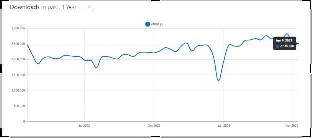
According to npmtrends, Chart.js has around 2.7 million weekly downloads and around 60.4K stars on Github, which shows the significant popularity of the library.
Getting started with Chart.js
Now that we know what Chart.js is, let’s look into how to install Chart.js on your project so that we can begin using it.
Installation
You have the flexibility to choose your preferred package manager. In this guide, we will focus on npm and yarn for installation.
NPM
npm install chart.js
Yarn
yarn add chart.js
Alternatively, you can also include Chart.js in your project using a CDN.
<script src=”https://cdn.jsdelivr.net/npm/chart.js“></script>
Once Chart.js is installed, you can include it in your project by importing it into your JavaScript file using the import statement.
Creating a Basic HTML File with Chart.js
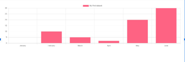
Let’s create a simple bar chart. I’ll be using the Vanilla Vite template, but feel free to use your preferred setup.
File name: index.html
<!DOCTYPE html>
<html lang=“en”>
<body>
<div id=“app”>
<canvas id=“canvas” width=“500” height=“500”></canvas>
</div>
<script type=“module” src=“/main.js”></script>
</body>
</html>
We have an HTML file with a canvas element inside the <body> tag, which we will use as the target to display the charts on the web page.
File name: main.js
import Chart from ‘chart.js/auto’;
const ctx= document.getElementById(‘canvas’).getContext(‘2d’);
const myChart= new Chart(ctx, {
type: ‘bar’,
data: {
labels: [‘January’, ‘February’, ‘March’, ‘April’, ‘May’, ‘June’],
datasets: [{
label: ‘My First dataset’,
backgroundColor: ‘rgb(255, 99, 132)’,
data: [0, 10, 5, 2, 20, 30, 45]
}]
},
options: {}
});
The provided code utilizes Chart.js to create a bar chart. It involves importing Chart.js, obtaining the canvas context, and creating a new chart instance with data and options. Customization can be done by modifying the data and options in the configuration object.
Now that we know how to set up basic charts using Charts.js, let’s discuss the various charts available.
Chart Types and Customization
Chart.js offers a wide range of chart types and elements for data visualization. In this section, we will explore the different types of charts available, including bar charts, line charts, pie charts, radar charts, and more.
Bar Chart
A bar chart is the most basic type of chart in which data is represented by vertical bars. Bar charts are a popular way to show data in a way that is both visually appealing and easy to understand. They are often used to compare and visualize data across different categories or data points.
Using the type of property, you can define your bar chart using Chart.js, the sample config of a bar chart is shown below.
const config = {
type: ‘bar’,
data: data,
options: {
scales: {
y: {
beginAtZero: true
}
}
},
};
The bar chart allows several properties to be specified for each dataset. Some of the most commonly used properties are, backgroundColor, barPercentage, barThickness, borderColor, etc
Here is an example of how you can display a set of data in a bar chart:
import Chart from ‘chart.js/auto’;
const cryptoData = {
labels: [ ‘Ethereum’, ‘Binance Coin’, ‘Cardano’, ‘Solana’],
datasets: [{
label: ‘Price in USD’,
data: [ 3000, 600, 220.5, 180],
backgroundColor: ‘rgba(75, 192, 72, 0.8)’, // Bar color
borderColor: ‘rgba(75, 102, 12, 1)’, // Bar border color
}]
};
// Create a bar chart
const ctx = document.getElementById(‘canvas’).getContext(‘2d’);
const cryptoChart = new Chart(ctx, {
type: ‘bar’,
data: cryptoData,
options: {
scales: {
y: {
beginAtZero: true
}
}
}
});
Output

Area Chart
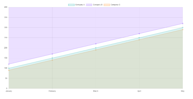
Area charts are useful for showing the overall trend and size of data, especially when comparing multiple data series. They can be used to show how sales or revenue have changed over time or to compare how data is spread across different categories.
Here is an example of using an area chart. We use the fill method to convert the line chart into an area chart:
import Chart from ‘chart.js/auto’;
const ctx = document.getElementById(‘canvas’).getContext(‘2d’);
const labels = [‘January’, ‘February’, ‘March’, ‘April’, ‘May’];
const data = {
labels: labels,
datasets: [{
label: ‘Company A’,
data: [100, 150, 200, 250, 300, 350],
backgroundColor: ‘rgba(75, 192, 192, 0.2)’,
borderColor: ‘rgba(75, 192, 192, 1)’,
borderWidth: 1,
fill:“start”
}, {
label: ‘Company B’,
data: [120, 170, 220, 270, 320, 370],
backgroundColor: ‘rgba(153, 102, 255, 0.2)’,
borderColor: ‘rgba(153, 102, 255, 1)’,
borderWidth: 1,
fill:“end”
}, {
label: ‘Company C’,
data: [90, 140, 190, 240, 290, 340],
backgroundColor: ‘rgba(255, 159, 64, 0.2)’,
borderColor: ‘rgba(255, 159, 64, 1)’,
borderWidth: 1,
fill:“origin”
}, ]
};
const options = {
scales: {
x: {
beginAtZero: true
},
y: {
beginAtZero: true
}
}
};
const myChart = new Chart(ctx, {
type: ‘line’,
data: data,
options: options
});
Output
Bubble chart
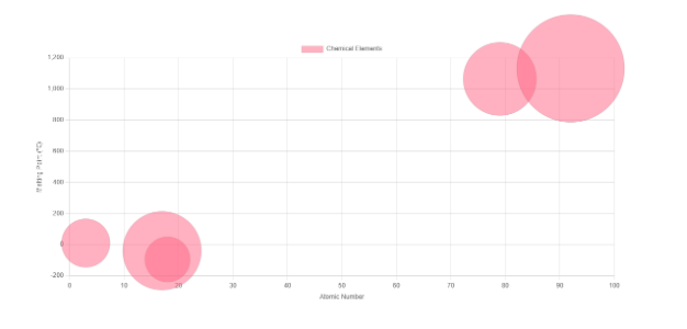
A bubble chart is a data visualization that displays three dimensions of data simultaneously. It uses the horizontal and vertical axes to determine the location of each bubble based on the first two dimensions, while the size of the bubbles represents the third dimension.
Here’s an example of a bubble chart using chemistry data:
import Chart from ‘chart.js/auto’;
const ctx = document.getElementById(‘canvas’).getContext(‘2d’);
const data = {
datasets: [{
label: ‘Elements’,
data: [{
x: 3, y: 10, r: 45, }, {
x: 18,
y: –95,
r: 42,
}, {
x: 79,
y: 1064,
r: 68,
}, ]
}]
};
const options = {
responsive: true,
scales: {
x: {
type: ‘linear’,
position: ‘bottom’,
beginAtZero: true,
title: {
display: true,
text: ‘Atomic Number’
}
},
y: {
type: ‘linear’,
position: ‘left’,
title: {
display: true,
text: ‘Melting Point (°C)’
}
}
}
};
const myChart = new Chart(ctx, {
type: ‘bubble’,
data: data,
options: options
});
Output:
Pie Charts
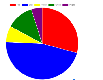
In a pie chart, slices of the data are used to represent various categories or values in a circular format. Pie charts are commonly used to display data in graphical formats.
Here is an example of a pie chart:
import Chart from ‘chart.js/auto’;
const ctx = document.getElementById(‘canvas’).getContext(‘2d’);
const data = {
labels: [‘Red’, ‘Blue’, ‘Yellow’, ‘Green’, ‘Purple’],
datasets: [{
label: ‘Colors’,
data: [12, 19, 3, 5, 2],
backgroundColor: [‘red’, ‘blue’, ‘yellow’, ‘green’, ‘purple’]
}]
};
const options = {
responsive: true
};
const myChart = new Chart(ctx, {
type: ‘pie’,
data: data,
options: options
});
Output
Polar Area Chart
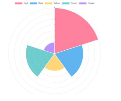
Polar area charts are akin to pie charts, but with the distinction that each segment has the same angle while the radius of the segment varies based on the value. This type of chart is commonly used when comparing data, similar to a pie chart, but also needing to show a scale of values for contextual understanding.
Here’s an example of a polar area chart using Chart.js:
import Chart from ‘chart.js/auto’;
const ctx = document.getElementById(‘canvas’).getContext(‘2d’);
const myChart = new Chart(ctx, {
type: ‘polarArea’,
data: {
labels: [‘Red’, ‘Blue’, ‘Yellow’, ‘Green’, ‘Purple’],
datasets: [{
label: ‘My Dataset’,
data: [8, 5, 3, 5, 2],
backgroundColor: [‘rgba(255, 99, 132, 0.8)’, ‘rgba(54, 162, 235, 0.8)’, ‘rgba(255, 205, 86, 0.8)’, ‘rgba(75, 192, 192, 0.8)’, ‘rgba(153, 102, 255, 0.7)’],
hoverOffset: 4
}]
},
options: {}
});
Output:
Radar Chart
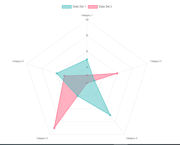
A radar chart is a graphical representation used to display multiple data points and their variations. It is commonly used to compare data points from two or more different data sets, making it a useful tool for data analysis.
Here’s an example of how you can create a radar chart using Chart.js.
import Chart from ‘chart.js/auto’;
var data = {
labels: [‘Category 1’, ‘Category 2’, ‘Category 3’, ‘Category 4’, ‘Category 5’],
datasets: [{
label: ‘Data Set 1’,
data: [5, 3, 7, 4, 6], backgroundColor: ‘rgba(75, 192, 192, 0.5)’, borderColor: ‘rgba(75, 192, 192, 1)’,
borderWidth: 2, }, {
label: ‘Data Set 2’,
data: [3, 6, 2, 9, 5],
backgroundColor: ‘rgba(255, 99, 132, 0.5)’,
borderColor: ‘rgba(255, 99, 132, 1)’,
borderWidth: 2,
}]
};
var options = {
scale: {
angleLines: {
display: true,
color: ‘rgba(0, 0, 0, 0.1)’, },
ticks: {
beginAtZero: true,
min: 0,
max: 10,
stepSize: 2,
showLabelBackdrop: false,
},
}
};
var ctx = document.getElementById(‘canvas’).getContext(‘2d’);
var radarChart = new Chart(ctx, {
type: ‘radar’,
data: data,
options: options
});
Output
Scatter Chart
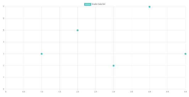
Scatter charts are a type of chart that is derived from basic line charts, with the x-axis changed to a linear axis. In order to create a scatter chart, data must be provided as objects containing X and Y properties.
Here is an example of a scatter chart:
import Chart from ‘chart.js/auto’;
var data = {
datasets: [{
label: ‘Scatter Data Set’,
data: [{x: 1, y: 3}, {x: 2, y: 5}, {x: 3, y: 2}, {x: 4, y: 7}],
backgroundColor: ‘rgba(75, 192, 192, 0.5)’, borderColor: ‘rgba(75, 192, 192, 1)’, borderWidth: 2,
}]
};
var options = {
scales: {
x: {
type: ‘linear’, beginAtZero: true,
},
y: {
type: ‘linear’, beginAtZero: true,
}
}
};
var ctx = document.getElementById(‘canvas’).getContext(‘2d’);
var scatterChart = new Chart(ctx, {
type: ‘scatter’,
data: data,
options: options
});
Output
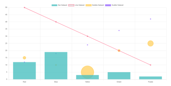
Mixed Chart Types
With Chart.js, You create mixed charts that are a combination of two or more different chart types. Here is an example of using mixed charts:
import Chart from ‘chart.js/auto’;
var ctx = document.getElementById(‘canvas’).getContext(‘2d’);
var mixedChart = new Chart(ctx, {
type: ‘bar’,
data: {
labels: [‘Red’, ‘Blue’, ‘Yellow’, ‘Green’, ‘Purple’],
datasets: [{
label: ‘Bar Dataset’,
data: [12, 19, 3, 5, 2],
backgroundColor: ‘rgba(75, 192, 192, 0.8)’ }, {
label: ‘Line Dataset’,
data: [50, 40, 30, 20, 10],
fill: “false”,
borderColor: ‘rgba(255, 99, 132, 1)’, borderWidth: 2,
type: ‘line’
}, {
label: ‘Bubble Dataset’,
data: [{
x: 2,
y: 15,
r: 10
}, {
x: 3,
y: 10,
r: 5
}, {
x: 4,
y: 5,
r: 45
},],
backgroundColor: ‘rgba(255, 205, 86, 0.7)’,
borderWidth: 2, type: ‘bubble’
}, {
label: ‘Scatter Dataset’,
data: [{
x: 3,
y: 12
}, {
x: 2,
y: 18
}, {
x: 1,
y: 24
}],
backgroundColor: ‘rgba(153, 102, 255, 0.8)’,
borderWidth: 1,
type: ‘scatter’
}]
},
});
Output:
Customizing the Charts
Chart.js allows you to customize the appearance and behavior of charts by configuring various options. Let’s take a closer look at some of the customization options available in Chart.js.
Animation: Chart.js allows you to animate charts using various options, which can help you achieve a polished and clean appearance.
const config = {
type: ‘line’,
data: data,
options: {
animations: {
tension: {
duration: 1000,
easing: ‘linear’,
from: 1,
to: 0,
loop: true
}
}
}
};
Responsive Charts: Chart.js offers a few options to enable responsiveness and regulate how charts resize themselves by monitoring changes in canvas display size and updating the render size accordingly.
var ctx = document.getElementById(‘myChart’).getContext(‘2d’);
var myChart = new Chart(ctx, {
type: ‘bar’,
data: {…},
options: {
responsive: true,
aspectRatio: 1,
onResize: function(chart, newSize) {
}
}
});
Title: It is the title of the chart that you often see at the top of the chart
const chart = new Chart(ctx, {
type: ‘line’,
data: data,
options: {
plugins: {
title: {
display: true,
text: ‘Custom Chart Title’
}
}
}
});
You can learn about all of the available customization options by reading the official documentation. There are a lot more than you might think.
Finishing up
Congratulations on completing this guide on getting started with Chart.js!
We have covered various concepts of Chart.js and have seen at least one example of all the charts available in Chart.js. We have also delved into customization options, including configuring appearance, behavior, and animation.
Happy learning!


Add comment