Just imagine, if you visit a website with several elements on the screen and you, as a developer, want to direct the user’s attention to a specific part of the website. How can you achieve that?
One straightforward way is to use CSS shadows. For example, you have two boxes as shown in the image below. Which one did you focus on first?
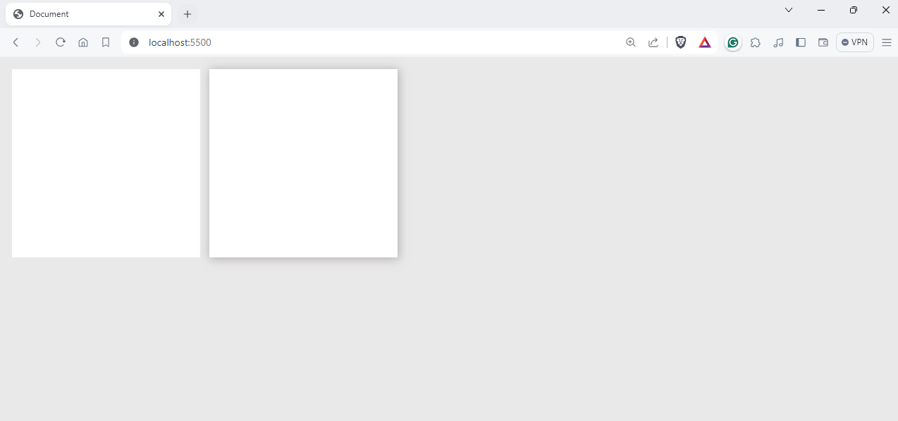
The chances are high that you selected the second box because it gives a pop-out appearance, leading users to be more attracted to it. That’s the beauty of CSS shadows.
In this detailed blog on CSS shadows, we will discuss various types of CSS shadows, including box shadow, text shadow, and more.
Without further ado, let’s get started
What is CSS shadow
CSS shadows allow frontend developers like you and me to add shadows to boxes such as <div>, <buttons>, <images> and other valid elements. In CSS, there are primarily two kinds of shadows: text shadows and box shadows. Shadows can be used to improve the visual hierarchy of elements on a webpage, drawing attention to important content or creating a sense of depth.
Let’s now look into the types of shadows in depth
CSS Box Shadow
The box-shadow property in CSS allows you to add shadow effects around an element like <div>. With this property, you can specify various parameters including the width, spread radius, blur amount, and color of the shadow. This flexibility allows for precise control over the appearance of the shadow
Syntax
box-shadow: [horizontal offset] [vertical offset] [blur radius] [spread radius] [color];
- Horizontal offset: The horizontal offset specifies the <X> distance from the element
- Vertical offset: The vertical offset specifies the <Y> distance of the shadow from the element
- Blur radius: The blur radius specifies the amount of blur radius of the shadow. A higher value creates a more diffused and spread shadow.
- Spread radius: The spread radius is the radius of the shadow where it will spread. A positive value expands the shadow, while a negative value contracts it.
- Color: The color value specifies the color of the shadow.
Here is an example of using CSS box-shadow:
HTML
<!DOCTYPE html>
<html lang=“en”>
<head>
<meta charset=“UTF-8” />
<meta name=“viewport” content=“width=device-width, initial-scale=1.0” />
<title>Document</title>
<style>
body {
display: flex;
background: #e9e9e9;
justify-content: center;
align-items: center;
height: 100vh;
}
.div {
width: 400px;
height: 400px;
background: rgb(255, 255, 255);
box-shadow: 10px 10px 100px 10px #b7b2b2;
}
</style>
</head>
<body>
<div class=“div”></div>
</body>
</html>
Output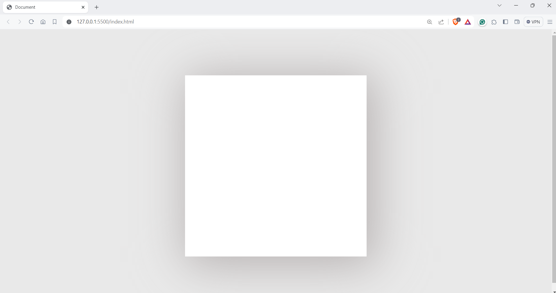
You can choose the best value depending on the needs of your web page. Shadows can also bring depth to your elements, just like in the example below.
.div {
width: 400px;
height: 400px;
background: rgb(12, 180, 247);
box-shadow: 1px 1px 10px 3px #8d8383;
}
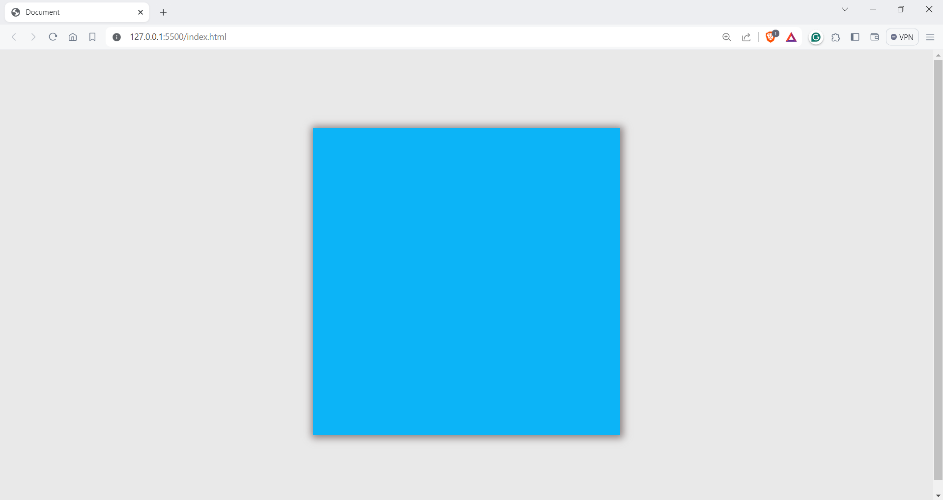
You can see in the example that the box is highlighted, creating depth around it
Let’s now look into another type of shadow: text shadows.
CSS Text Shadows
The text-shadow property is almost similar to the box-shadow property, but the shadow is applied to text elements in this case. Text shadows can be a great way of making text stand out against the background.
Syntax
text-shadow: [horizontal offset] [vertical offset] [blur radius] [color];
- Horizontal offset: The horizontal offset specifies the horizontal distance of the shadow from the text.
- Vertical offset: The vertical offset specifies the vertical distance of the shadow from the text.
- Blur radius: The blur radius is an optional value. The blur radius specifies the blur radius of the shadow. A higher value creates a more diffuse shadow. If omitted, the shadow is sharp.
- color: The color value specifies the color of the shadow. You can use color names, RGB values, or hex values.
Let’s take an example and see it in action
Code
<!DOCTYPE html>
<html lang=“en”>
<head>
<meta charset=“UTF-8” />
<meta name=“viewport” content=“width=device-width, initial-scale=1.0” />
<title>Document</title>
<style>
body {
display: flex;
background: #e9e9e9;
justify-content: center;
align-items: center;
height: 100vh;
}
.div {
width: 500px;
height: 300px;
background: #6b5a99;
padding: 15px;
border-radius: 10px;
margin: 10px;
}
.with__shadows__h1 {
color: #fff;
text-shadow: 2px 7px 5px rgba(23, 2, 43, 0.3),
0px -4px 10px rgba(255, 255, 255, 0.3);
}
.with__shadows__p {
color: #fff;
text-shadow: 2px 7px 5px rgba(24, 1, 1, 0.3),
0px -4px 10px rgba(255, 255, 255, 0.3);
}
h1,
p {
color: #fff;
}
</style>
</head>
<body>
<div class=“div”>
<h1 class=“with__shadows__h1”>
The #1 All-In-One Destination For Global Work
</h1>
<p class=“with__shadows__p”>
Talent500 is a talent solutions platform with all the software,
integrations, and intelligence you need to build and manage a
world-class workforce.
</p>
</div>
<div class=“div”>
<h1 class=“without__shadows__h1”>
The #1 All-In-One Destination For Global Work
</h1>
<p class=“without__shadows__p”>
Talent500 is a talent solutions platform with all the software,
integrations, and intelligence you need to build and manage a
world-class workforce.
</p>
</div>
</body>
</html>
Output

We have the same code for both texts, except for the one on the left, which has a text shadow, giving a slight depth to the text.
Let’s now look into CSS drop shadows
CSS Box Shadow with inset
CSS also offers a feature called inset shadows, which create the illusion of shadows appearing inside an element rather than outside. This is particularly useful for drawing attention to content within the element itself.
The syntax for applying an inset shadow is quite similar to that of regular shadows but with the addition of the keyword inset. This simple adjustment allows developers to create a variety of effects and enhance the visual appeal of their designs.
Syntax
box-shadow: inset [horizontal offset] [vertical offset] [blur radius] [spread radius] [color];
Code
<!DOCTYPE html>
<html lang=“en”>
<head>
<meta charset=“UTF-8” />
<meta name=“viewport” content=“width=device-width, initial-scale=1.0” />
<title>Document</title>
</head>
<style>
body {
display: flex;
justify-content: center;
align-items: center;
height: 100vh;
margin: 0;
background: rgb(223, 222, 222);
}
.shadow {
width: 300px;
height: 300px;
background-color: #f1efef;
box-shadow: 1px 5px 20px 10px rgb(163, 154, 154);
margin: 20px;
}
.shadow.inset {
width: 300px;
height: 300px;
background-color: #ffffff;
box-shadow: inset 1px 5px 20px 10px rgb(163, 154, 154);
margin: 20px;
}
p {
text-align: center;
padding: 20px;
}
</style>
<body>
<div class=“shadow”>
<p>Box shadow</p>
</div>
<div class=“shadow inset”>
<p>Box shadow with Inset</p>
</div>
</body>
</html>
Output
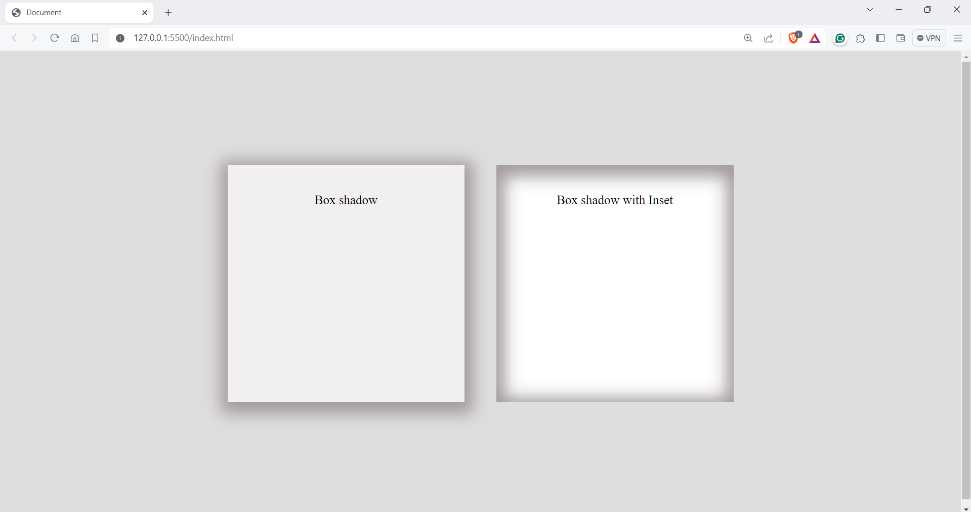
Now that we know about CSS shadow, let now look at some advanced tricks with shadows.
Creating Layered Shadows
Layered shadows involve adding multiple shadow effects to one element. You can stack different shadows with various offsets and radii, creating a blending effect. This technique allows for more complex and detailed visual effects, enhancing the depth and dimension of the element.
Let’s look into an example
Code:
<!DOCTYPE html>
<html lang=“en”>
<head>
<meta charset=“UTF-8” />
<meta name=“viewport” content=“width=device-width, initial-scale=1.0” />
<title>Box shadow example</title>
<style>
body {
display: flex;
justify-content: center;
align-items: center;
height: 100vh;
margin: 0;
background-color: azure;
}
.shadow.box {
box-shadow: 0 6px 6px hsl(0deg 0% 0% / 0.3);
}
.layered.box {
box-shadow: 0 1px 1px rgba(0, 0, 0, 0.075),
0 2px 2px rgba(247, 100, 100, 0.075), 0 4px 4px rgba(0, 0, 0, 0.075),
0 8px 8px rgba(0, 0, 0, 0.075), 0 16px 16px rgba(0, 0, 0, 0.075);
}
.container {
display: flex;
gap: 32px;
}
.box {
width: 400px;
height: 400px;
border-radius: 8px;
background-color: white;
}
</style>
</head>
<body>
<section class=“container”>
<div class=“shadow box”></div>
<div class=“layered box”></div>
</section>
</body>
</html>
Output
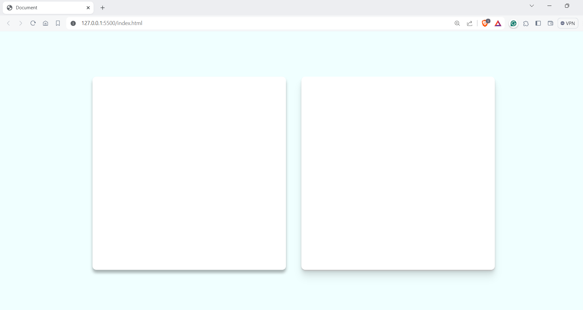
In the example, you can see that the right box has an optimal shadow compared to the left one. We can use multiple shadows to create that realistic effect.
The syntax for layered shadows is quite similar to that of a regular box shadow. However, instead of specifying just one shadow effect, we use an array of shadows separated by commas. This means we can define multiple shadow effects within a single property, each with its own set of parameters such as offset, blur radius, and color.
.box {
box-shadow:
/* Shadow 1 */
offsetX1 offsetY1 blurRadius1 spreadRadius1 color1,
/* Shadow 2 */
offsetX2 offsetY2 blurRadius2 spreadRadius2 color2,
/* Shadow 3 */
offsetX3 offsetY3 blurRadius3 spreadRadius3 color3,
/* And so on… */
;
}
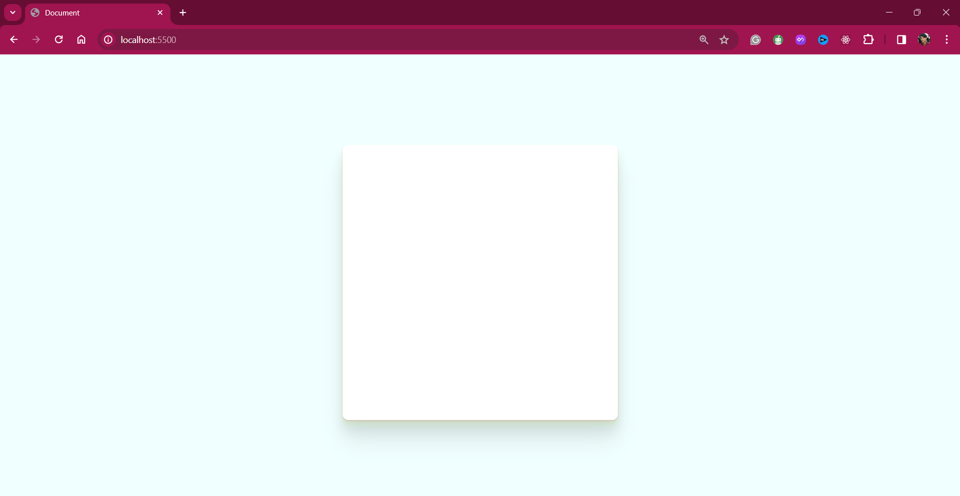
This approach also enables the creation of gradient shadows, which can significantly enhance the visual appeal of websites.
.layered.box {
box-shadow:
0 1px 1px rgba(0, 0, 0, 0.075),
0 2px 2px rgba(247, 100, 100, 0.075),
0 4px 4px rgba(247, 100, 100, 0.075),
0 8px 8px rgba(197, 243, 166, 0.301),
0 16px 16px rgba(0, 0, 0, 0.075),
0 32px 32px rgba(0, 0, 0, 0.075) ;
}
Wrapping it up
Thanks for reading this blog; you are a fantastic reader.
In this detailed blog, we have taken a closer look at CSS shadows, covering everything from basic box shadows to more advanced techniques like text shadows and layered shadows. The shadow property is a handy CSS feature, and with a little bit of creativity, you can create engaging visual elements on the web.
Keep learning





Add comment