Building a complex website layout used to be a real headache, but now we’ve got two powerful tools in CSS that make it a lot easier: flexbox and grid. Flexbox is great for creating layouts that are primarily in a single row or column — that is, one-dimensional layouts.
Grid, on the other hand, is perfect when you want to design layouts that involve both rows and columns, making it ideal for two-dimensional layouts. What exactly do we mean by two-dimensional layout?
Well, whenever you need to arrange your content across both rows and columns, you’re dealing with a two-dimensional layout. Let me walk you through some examples to show you what I mean:
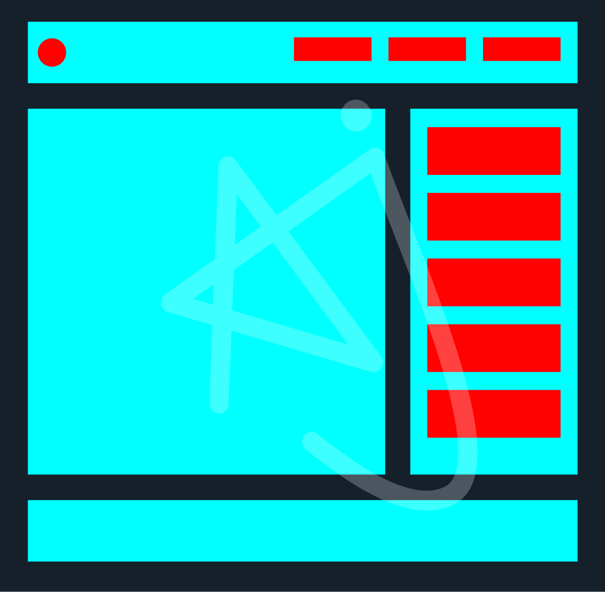
In the above layout, you see a very common two-dimensional layout of a website. But why do I call it a two-dimensional layout?
It’s because this layout is divided into rows and columns — specifically, there are three rows and two columns. That means we need to use a grid to build this layout.
However, you might also notice that inside the header and the sidebar of this layout, there are a few red boxes. These look like one-dimensional layouts, don’t they? So, after setting up the entire layout using CSS Grid, we can create one-dimensional layouts within specific grid items using CSS Flexbox.

So, here’s the second example of a layout in the above image. Can you guess the dimensions of this layout?
Yes, you’re right; it’s also a two-dimensional layout. Here’s a tip: when analyzing a layout, look at the overall structure instead of getting caught up in the details like how many navigation links are in the header or how many paragraphs, headings, buttons, and images are in the Hero section of the website.
In this layout, we have two rows and two columns as well. Take a look at the picture below to see the exact rows and columns of the layout mentioned above.

As you might have guessed, there are two rows in the above image. And in the image below, as you can see, there are two columns as well.
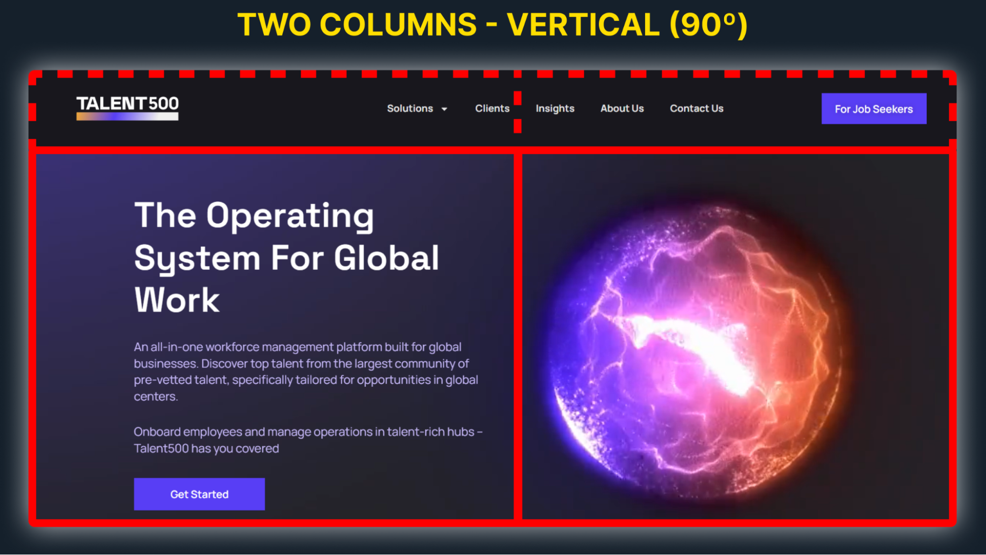
In this blog, we’re going to see and build the same layout as the Hero section of the Talent500 website. Please visit the homepage of the website once, and then come back to this blog to start building the same layout that you saw.
To build this layout, we will of course use CSS Grid. Although there are many properties available, I’ll focus on the essential ones that you really need to know. However, if you want to learn about CSS Grid in more detail, I recommend exploring it further through this link.
Visualizing Layouts: Thinking in Rows and Columns
Before building any grid layouts, the first thing you need to do is visualize the layout in your mind in terms of rows and columns. Then, try to build the layout as you visualized, using placeholders. But wait, what do I mean by placeholders?
By placeholders, I mean creating a dummy grid layout first, without any content inside. Just set up the layout using boxes, similar to what you see in the image below.
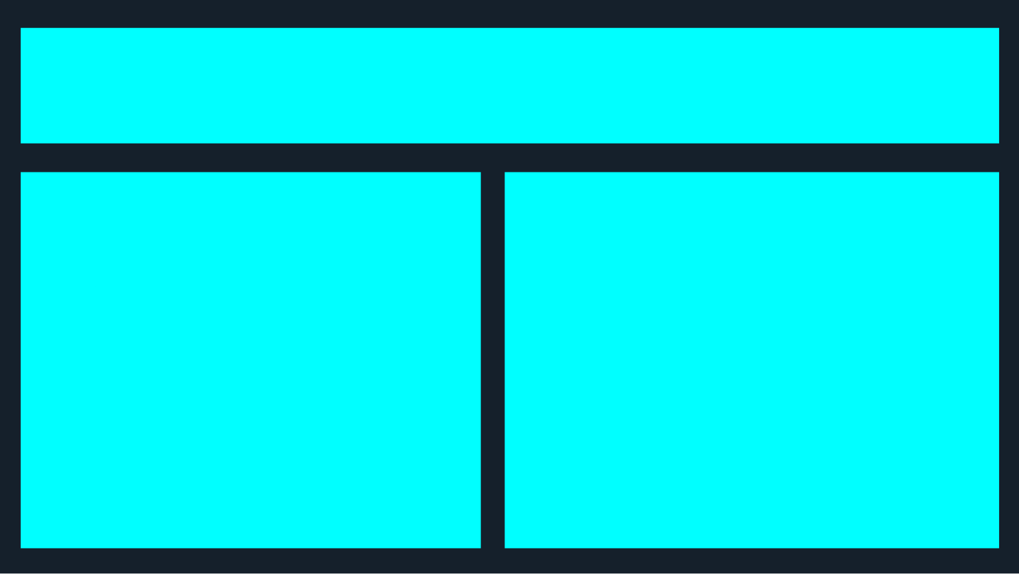
Now, let’s build the above layout first, and we’ll think about the rest of the details later.
From Visualizing the Layout to Action
So, during visualization, you noticed three elements in the above layout, right? Let’s go ahead and write the HTML for those elements.
<div class=“container”>
<div class=“header”></div>
<div class=“left”></div>
<div class=“right”></div>
</div>
Now, in CSS, we need to make the container a grid layout by setting the display property to “grid“. Then, we will divide the layout into rows and columns using two grid properties:
grid-template-rows:
This property is used to define the height of each row in our grid. We have specified the size of each row one by one, using values like pixels (px), percentages (%), or even flexible units like fr for fractions of the available space.
grid-template-columns:
Similar to grid-template-rows, this property defines the width of each column. We have to set the width of each column individually, and just like rows, we can use px, %, fr, and other units.
Note: fraction unit (fr)
The fr unit is a super handy unit we use when working with CSS Grid. fr stands for “fraction”, and it helps us divide up space within our grid layout easily.
This is useful when we want to divide our grid space proportionally, without worrying about the exact measurements of each part. It adapts based on the total space available, making our layout more flexible and responsive to different screen sizes.
.container {
height: 100vh;
width: 100vw;
display: grid;
grid-template-rows: 100px 1fr;
grid-template-columns: 1fr 1fr;
}
Doesn’t anything appear on the webpage? No worries, just set the background color for all the grid items, such as:
.header {
background: red;
}
.left {
background: green;
}
.right {
background: blue;
}
Now something appears on the page, right? Congratulations! ✨
Now, inspect the element and enable the grid lines from the developer tools in your browser. After enabling it, you will see grid number lines on top of your grid layout, something like this:
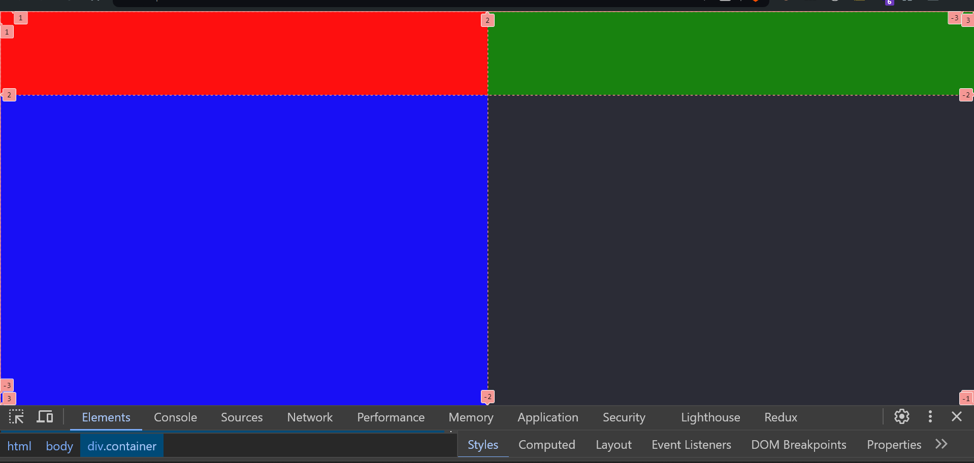
Now, the red box should span from the starting point to the very end, right? To achieve this, we need to use two more grid-item properties:
grid-row
The grid-row property specifies where an item should be placed within the grid in terms of the row start and row end lines.
This property can take two values separated by a slash (/), where the first value indicates the start line, and the second value indicates the end line.
By defining these start and end points, we can control which rows an item spans. For example, in our case, it is 1/2 (you can see the grid number lines by inspecting the element).
grid-row: 1/2; means the item will start at the first row line and end at the second row line, effectively occupying just the first row.
grid-column
Similarly, grid-column functions like grid-row but controls placement along the column axis. It also takes two values separated by a slash (/), where the first value is the start column line, and the second is the end column line. This setup determines how many columns an item spans across.
In our case, grid-column: 1/3; tells the item to start at the first column line and extend to the third column line, covering the space of two columns.
By using both grid-row and grid-column, we can precisely define an item’s position and area within the grid container.
The item specified with grid-row: 1/2; and grid-column: 1/3; will span the full height of the first row and the width of the first two columns, creating a specific area for that item within the grid layout.
These properties provide powerful control over the layout, allowing for complex designs that adapt to content needs and screen sizes.
Here is the code for the header element:
.header {
background: red;
grid-row: 1/2;
grid-column: 1/3;
}
Now our two-dimensional layout is looking pixel-perfect, right?
Filling Placeholders with Content
After creating the grid layout, I am now going to populate our placeholders with content, including navigation links, a logo, hero text, and a hero video.
<div class=“container”>
<div class=“header”>
<a href=“/”
><img
src=“https://multisite.talent500.co/demo/wp-content/uploads/sites/3/2023/06/New_logoWhite.png”
alt=“Talent500 logo”
/></a>
<nav class=“nav”>
<ul class=“nav_links_container”>
<li>
<a href=“#”>Solutions</a>
</li>
<li><a href=“#”>Clients</a></li>
<li><a href=“#”>Insights</a></li>
<li><a href=“#”>About Us</a></li>
<li><a href=“#”>Contact Us</a></li>
</ul>
</nav>
<div class=“job_seeker_container”>
<a href=“#”>For Job Seekers</a>
</div>
</div>
<div class=“left”>
<h1>The Operating System For Global Work</h1>
<p>
An all-in-one workforce management platform built for global
businesses. Discover top talent from the largest community of
pre-vetted talent, specifically tailored for opportunities in global
centers.
</p>
<p>
Onboard employees and manage operations in talent-rich hubs –
Talent500 has you covered
</p>
<div><a href=“#”>Get Started</a></div>
</div>
<div class=“right”>
<video muted autoplay loop>
<source
src=“https://cp-preprod-wordpress.talent500.co/demo/wp-content/uploads/sites/4/2023/07/Hero-banner.mp4”
type=“video/mp4”
/>
</video>
</div>
</div>
Now, style the content within the placeholders according to your needs using CSS. I won’t be covering concepts outside of the CSS grid in this blog, so feel free to copy the code from the snippets provided below.
.container {
height: 100vh;
width: 100vw;
display: grid;
grid-template-rows: 100px 1fr;
grid-template-columns: 1fr 1fr;
}
.header {
grid-row: 1/2;
grid-column: 1/3;
display: flex;
justify-content: space-between;
align-items: center;
padding: 0 40px;
}
.header a img {
height: 40px;
}
.nav_links_container {
display: flex;
list-style: none;
gap: 18px;
}
.nav_links_container li {
font-size: 18px;
}
.nav_links_container li a {
color: #fff;
text-decoration: none;
transition: all 0.2s ease;
}
.nav_links_container li a:hover {
color: #6043e7;
}
.job_seeker_container a {
color: #fff;
background: #6043e7;
padding: 20px 30px;
text-decoration: none;
border: 1px solid #6043e7;
transition: all 0.2s ease;
}
.job_seeker_container a:hover {
background: none;
color: #4994e5;
}
.right {
grid-row: 2/3;
grid-column: 1/3;
}
video {
height: 100%;
width: 100%;
object-fit: cover;
}
.left {
grid-row: 2/3;
grid-column: 1/2;
z-index: 8;
align-self: center;
color: #fff;
padding-left: 40px;
}
.left h1 {
font-size: 60px;
margin-bottom: 24px;
}
.left p {
font-size: 22px;
color: #c9bbfc;
margin-bottom: 28px;
}
.left div a {
color: #fff;
background: #6043e7;
padding: 20px 60px;
font-weight: bold;
text-decoration: none;
border: 1px solid #6043e7;
transition: all 0.2s ease;
display: inline-block;
}
.left div {
margin-top: 18px;
}
.left div a:hover {
background: none;
color: #4994e5;
}
Spanning the Video Across Both Columns

The video we are using in our markup measures 1920 x 1080 pixels. We need to span this video across both columns, similar to the header, right? You might wonder if this is something you can do on your own?
Well, it’s not too tough. You just need to span the column from 1 to 3. We also need to make this video responsive. Check out the code below:
.right {
grid-row: 2/3;
grid-column: 1/3;
}
video {
height: 100%;
width: 100%;
object-fit: cover;
}
Revealing the Text Content
After spanning the text content across both columns, you might notice that the hero section’s text is now hidden, right? Consider this your challenge to fix it.
Well, it’s quite simple; we just need to set a z-index with any positive value. Check out the code below:
.left {
grid-row: 2/3;
grid-column: 1/2;
z-index: 8;
align-self: center;
color: #fff;
padding-left: 40px;
}
We’ve now built a hero section similar to Talent500, haven’t we? Next, we need to make the entire homepage responsive. I’m giving you the challenge to ensure that this homepage is clearly visible on small screens as well. All the best!
Here is the complete code on the codepen: Click here
Conclusion
We’ve tackled how to create a complex layout using CSS Grid, specifically focusing on building a responsive hero section like the one on the Talent500 website. By now, you should feel more comfortable using CSS Grid to craft two-dimensional layouts and make them adapt smoothly across different devices.
Remember, the key is to practice. The more you play around with these settings, the more intuitive designing with CSS Grid will become. I’ve given you the tools and shown you the basics — now it’s your turn to experiment and see what you can create. Happy coding and all the best in your design journey!
Also, if you are looking for a JavaScript or React job, please search for them on Talent500.com



Add comment