Have you ever observed how quickly you make an opinion about a website or a product when you visit one? Well, research shows that it only takes an average user 0.05 seconds to do so! This is why having a great front end is so important for online businesses.
The front end of the web application is the doorway to your business and in today’s world, it is crucial to enhancing online performance and, ultimately, company success.
You all know how important CSS is for a website, and without CSS, we can’t even imagine using our favourite social media. In this blog, we will look at some of the cool CSS tricks that you can use on your website, and believe me, these tricks can be life savers. Some of these tricks might be new to you 🙂
Without further ado, let’s get started!
Trick 1: CSS clip-path property
The clip-path is a CSS property that lets you choose a certain area of an element (like an image or a shape) to show on your webpage. Anything outside of that area will be hidden or “clipped” away. By using clip-path, you can create complex shapes, such as circles, polygons, and even text, to mask and reveal elements in interesting ways, making your website stand out from the rest.
Think of it like cutting out a picture directly with scissors (but here on the webpage, of course) – you can choose which part of the picture you want to see, and everything else gets cut off. With clip-path, you can do the same thing digitally on your website.
Syntax:
clip-path: shape | url() | none;
In this example, we are using the polygon() function to create some complex shapes and later we use the clip-path property to apply the clipping. The polygon() function allows us to create a shape by defining a series of points. The clip-path property is then used to apply this shape as a clipping region on the image.
HTML
<div class=“clip-container” id=“c2”>
<img
id=“2”
src=“https://images.pexels.com/photos/3109808/pexels-photo-3109808.jpeg?auto=compress&cs=tinysrgb&w=600”
alt=“Example Image”
/>
<h1>With Clip-path</h1>
</div>
CSS
.clip-container {
width: 400px;
height: 400px;
border: 1px solid black;
margin: 150px;
}
#c2 {
clip-path: polygon(
0% 87%,
22% 58%,
19% 14%,
31% 21%,
100% 45%,
62% 100%,
19% 93%,
57% 13%,
84% 100%
);
}
Output
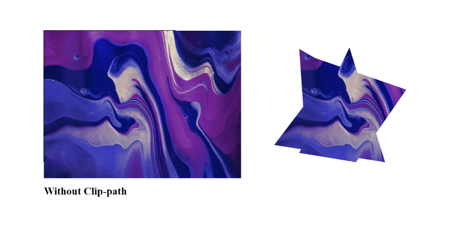
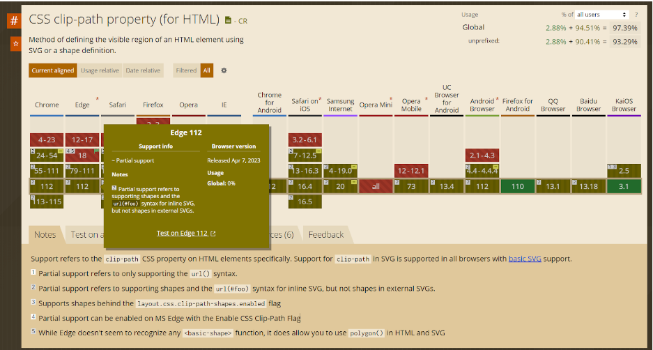
Note that the clip-path property is not supported by most of the browsers, they have only partial support.
Trick 2: CSS perspective property
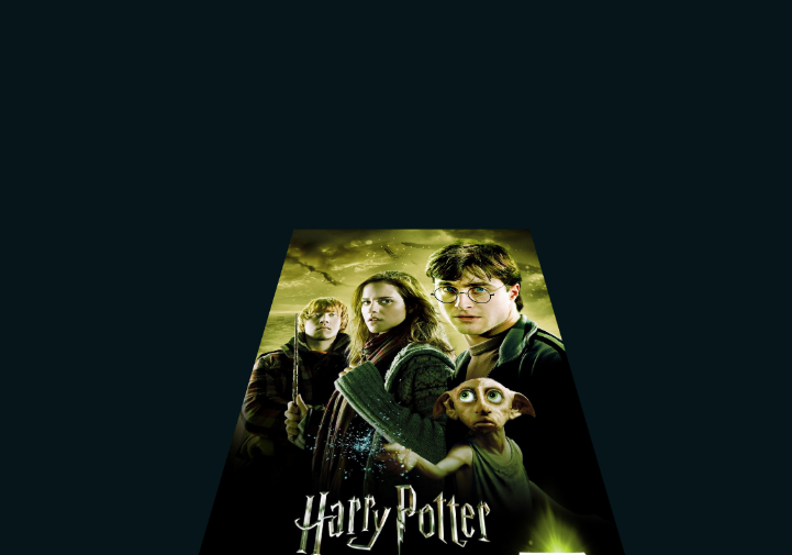
In CSS, the perspective property makes an element look like they’re in a 3D space. This makes seeing the element from different angles possible, just like seeing with our eyes.
Using the perspective property lets you control how far away the viewer is from the element. If you set a large value for the perspective property, the element will look smaller and flatter, like it’s far away. If you set a small value, the element will look bigger and more prominent, like it’s close up.
Syntax
perspective: length | none;
The following example shows you how to make a perspective touch to your div or image:
HTML
<div class=“poster”>
<img
class=“season_1”
id=“1”
src=“https://media.harrypotterfanzone.com/deathly-hallows-Apart-1-wizarding-world-poster.jpg”
/>
</div>
CSS
.season_1 {
width: 300px;
transition: 1s ease-in-out;
transform: perspective(400px) translateY(25%) rotateX(45deg) translateZ(0);
opacity: 0.99;
z-index: 1;
}
Output
Trick 3: CSS box-reflect property
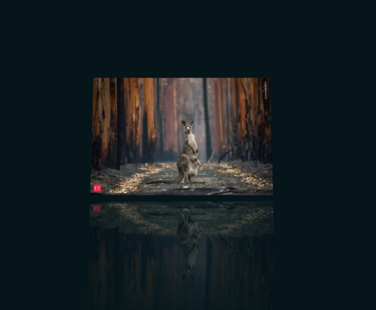
The CSS box-reflect property is a nifty tool that creates a reflection effect for an element. You can use it to create eye-catching visuals by reflecting an image, text, or other content on a mirrored surface.
To make it work, you just need to mention the direction and length of the reflection you want to create in the box-reflect property.
Syntax:
box-reflect: <direction> <offset> <mask-box-image>;
- <direction>: This is a required value that specifies the direction of the reflection. It can be one of four values: above, below, left, or right.
- <offset>: This is an optional value that specifies the distance between the box and the reflection. It can be defined in pixels or as a percentage of the box’s height or width.
- <mask-box-image>: This is an optional value that specifies the mask image to be used for the reflection. It can be any valid image URL or the keyword ‘none’
In the following example, you can see a really slick reflection of the image.
<div class=“poster”>
<img
class=“kangaroo”
id=“1”
src=“https://img.etimg.com/thumb/msid-94814920,width-1200,height-786,imgsize-60140,overlay-economictimes/photo.jpg”
/>
</div>
.kangaroo{
-webkit-box-reflect: below 10px linear-gradient(to bottom, rgba(0,0,0,0.0), rgba(0,0,0,0.4));
}
Output
Trick 4: Customized Text Selection in CSS
The::selection pseudo-element in CSS lets you style the part of a web page that a user selects. You can use it to highlight certain parts of your content or customize the way selected text looks.
Syntax:
::selection {
background-color: #ff00ff;
color: #ffffff;
}
In this example, the code applies a style to any text that a user selects within an h1 element. So, if someone selects any text in an h1 element on the page, that selected part of the text will be highlighted with the defined background color and text color.
HTML
<h1>
Talent500 brings you pre-assessed, highly qualified professionals from top talent hubs. Top global companies, from Fortune 500 to fast-growth startups, trust Talent500 to help them build high-impact remote teams.
</h1>
CSS
h1::selection{
background-color: rgb(255, 0, 123);
color: rgb(255, 255, 255);
}

Trick 5: Change Image Background Position
Sometimes you get pictures that need to be in a better dimension and you might need to edit them with some external tools. But with the background-position property can change the position of the image to any other location within the element. The first value is for mentioning the horizontal position of the image while the second value indicates the vertical position
Syntax:
background-position: x-axis y-axis;
x-axis: This determines the horizontal position of the image. You can choose to align the image to the left, center, or right of the element, or use length or percentage values to position it from the left edge. Positive values mean it will move the image to the right, while negative values move it to the left.
y-axis: This determines the vertical position of the image. You can choose to align the image to the top, center, or bottom of the element, or use length or percentage values to position it from the top edge. Positive values mean it moves the image down, while negative values move it up.
You can specify the position using different formats, such as keywords like “top”, “bottom”, “left”, or “right”, pixel values, percentages, or lengths.
In the following example we first set the image size to 400 pixels and transition smoothly to 600 pixels when the user hovers over the container. The image also moves to the top of the container and the container gains a rounded border.
HTML
<div class=“image-container”>
</div>
CSS
.image-container {
background: url(“https://fsb.zobj.net/crop.php?r=AOf2VJdtW1ZSjAUeBF_hDxpq1rN4wlwHsAuOGnVii5h69QH5PhOv__fMoeaV9q3mdMq5VsMJC2B0YiHG8RZzHW5AUJQtHdlGFFDpQ8hVlzerW64qRFw_kp2E1XlKmDyFytcjKs8H4zMolgL_McGwYSlUFdXM-Jf7i8sOKv3G28PMmHQJ_OTW9ztF6ltfrWURsG0qoBSEz7ncOiN2”);
background-repeat: no-repeat;
background-position: top center;
background-size: 400px;
width: 500px;
height: 500px;
transition: 1s ease-in-out;
}
.image-container:hover {
background-size: 600px;
background-position: top;
border-radius: 30px;
}
Output

Trick 6: Creating Rounded Borders with Individual Border Radius in CSS
You might be familiar with the CSS border-radius property with which we can have a border radius to all four sides of an element. But what if you only want to specify just one side of the border? Don’t worry, CSS also comes with properties for that. You can use the border-top-right-radius, border-bottom-left-radius, and border-bottom-right-radius properties for targeting individual borders.
Syntax:
f
border-top-right-radius: value;
border-bottom-left-radius: value;
border-bottom-right-radius: value;
border-top-left-radius: value;
In the given example, we are going to style an element’s border in an uneven way, this can be really handy if you want to create custom shapes using border-radius.
HTML
<div class=“borderDIV”></div>
CSS
.borderDIV {
border: 1px solid black;
width: 400px;
height: 400px;
background: blue;
border-top-right-radius: 15%;
border-bottom-left-radius: 45%;
border-bottom-right-radius: 15%;
}
Trick 7: Custom Scrollbar using CSS
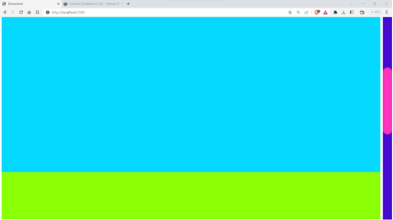
This is really a lesser-known trick. You can customize the look and feel of your scroll bar on your website. You can use the ::-webkit-scrollbar as well as the ::-webkit-scrollbar-thumb to achieve the same.
The ::-webkit-scrollbar is the background of the scroll bar, you can adjust the width background color etc. In a similar way the ::-webkit-scrollbar-thumb is the dragger and you can customize it to your needs.
Syntax:
selector::-webkit-scrollbar-thumb {
/* styles go here */
}
selector::-webkit-scrollbar-track {
/* styles go here */
}
selector::-webkit-scrollbar-track-piece {
/* styles go here */
}
selector::-webkit-scrollbar-corner {
/* styles go here */
}
selector::-webkit-resizer {
/* styles go here */
}
The following example shows you how to do that and keep this in mind that these pseudo-element has limited CSS properties that can be applied to it and you cannot apply properties like margin, or padding to them.
CSS
body::-webkit-scrollbar {
width: 30px;
background-color: rgb(70, 11, 207);
}
body::-webkit-scrollbar-thumb {
background-color: rgb(255, 53, 191);
box-shadow: inset 0 0 6px rgba(0, 0, 0, 0.3);
border-radius: 15px;
}
Output
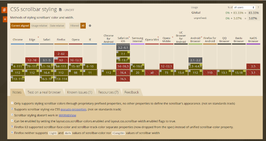
Note that currently, -the webkit-scrollbar selector is not supported by all the popular browsers.
Wrapping it up
Congratulations on reaching this far! You’re a fantastic reader!!
Throughout this blog, we’ve looked into some of the neat and clean CSS tips and tricks that you can use to take your styling skills to the next level. From creating custom scrollbars to manipulating background images and customizing borders, we hope these tips will inspire you to explore the endless possibilities of CSS.
Remember, CSS can do magic on the web, you just need to explore it.. With some practice and experimentation, you can unlock its full potential and create beautiful and engaging user experiences.
Happy styling!



Add comment