React-Bootstrap is a popular front-end framework that provides pre-built UI components for building web applications. It is built on top of Bootstrap, a popular CSS framework.
It makes it easier for developers to create beautiful and responsive user interfaces with ease. In this blog, we will look at how to build simple and efficient components with React-Bootstrap.
Installation

To get started with React-Bootstrap, you will need to install it in your project. You can do this by running the following command in your terminal:
npm install react-bootstrap bootstrap
This will install both React-Bootstrap and Bootstrap in your project.
Creating a Button Component
Let’s start by creating a simple button component using React-Bootstrap. Open your text editor and create a new file called Button.js. Then, add the following code:
import React from ‘react’;
import { Button } from ‘react-bootstrap’;
const MyButton = () => {
return (
<Button variant=”primary”>Click Me</Button>
);
}
export default MyButton;
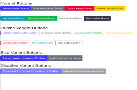
In the code above, we import the Button component from React-Bootstrap and use it to create our own MyButton component. We set the variant prop to “primary” to give the button a blue colour. You can also use other variants such as “secondary”, “success”, “danger”, “warning”, “info”, “light”, and “dark”.

To use this component in your application, you can import it and add it to your JSX code as follows:
import React from ‘react’;
import MyButton from ‘./Button’;
const App = () => {
return (
<div>
<MyButton />
</div>
);
}
export default App;
Creating a Form Component
Let’s now create a form component using React-Bootstrap. Open your text editor and create a new file called Form.js. Then, add the following code:
import React from ‘react’;
import { Form, Button } from ‘react-bootstrap’;
const MyForm = () => {
return (
<Form>
<Form.Group controlId=”formBasicEmail”>
<Form.Label>Email address</Form.Label>
<Form.Control type=”email” placeholder=”Enter email” />
<Form.Text className=”text-muted”>
We’ll never share your email with anyone else.
</Form.Text>
</Form.Group>
<Form.Group controlId=”formBasicPassword”>
<Form.Label>Password</Form.Label>
<Form.Control type=”password” placeholder=”Password” />
</Form.Group>
<Button variant=”primary” type=”submit”>
Submit
</Button>
</Form>
);
}
export default MyForm;
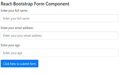
In the code above, we import the Form and Button components from React-Bootstrap and use them to create our own MyForm component. We use the Form.Group component to group form controls together, and set the controlId prop to provide a unique identifier for each group. We use the Form.Label component to add labels to form controls and the Form.Control component to create form inputs.

To use this component in your application, you can import it and add it to your JSX code as follows:
import React from ‘react’;
import MyForm from ‘./Form’;
const App = () => {
return (
<div>
<MyForm />
</div>
);
}
export default App;
Creating a Navbar Component
Let’s now create a navbar component using React-Bootstrap. Open your text editor and create a new file called Navbar.js. Then, add the following code
import React from ‘react’;
import { Navbar, Nav, Form, FormControl, Button } from ‘react-bootstrap’;
const MyNavbar = () => {
return (
<Navbar bg=”light” expand=”lg”>
<Navbar.Brand href=”#home”>My Website</Navbar.Brand>
<Navbar.Toggle aria-controls=”basic-navbar-nav” />
<Navbar.Collapse id=”basic-navbar-nav”>
<Nav className=”mr-auto”>
<Nav.Link href=”#home”>Home</Nav.Link>
<Nav.Link href=”#link”>Link</Nav.Link>
</Nav>
<Form inline>
<FormControl type=”text” placeholder=”Search” className=”mr-sm-2″ />
<Button variant=”outline-success”>Search</Button>
</Form>
</Navbar.Collapse>
</Navbar>
);
}
export default MyNavbar;
In the code above, we import the Navbar, Nav, Form, FormControl, and Button components from React-Bootstrap and use them to create our own MyNavbar component. We use the Navbar.Brand component to add a brand to the navbar and the Navbar.Toggle and Navbar.Collapse components to create a responsive navbar. We use the Nav component to create links in the navbar, and the Form and FormControl components to create a search bar.

To use this component in your application, you can import it and add it to your JSX code as follows:
import React from ‘react’;
import MyNavbar from ‘./Navbar’;
const App = () => {
return (
<div>
<MyNavbar />
</div>
);
}
export default App;.
More Features and Components in React-Bootstrap
There are many more components and features that you can explore to create even more complex and powerful UIs. In this section, we will take a closer look at some of these features and provide examples of how to use them.
Modals
Modals are a great way to display content and gather user input in a non-intrusive way. With React-Bootstrap, creating a modal is as simple as importing the Modal component and using it in your code.
javascript
Copy code
import React, { useState } from ‘react’;
import { Modal, Button } from ‘react-bootstrap’;
const MyModal = () => {
const [show, setShow] = useState(false);
const handleClose = () => setShow(false);
const handleShow = () => setShow(true);
return (
<>
<Button variant=”primary” onClick={handleShow}>
Launch demo modal
</Button>
<Modal show={show} onHide={handleClose}>
<Modal.Header closeButton>
<Modal.Title>Modal heading</Modal.Title>
</Modal.Header>
<Modal.Body>Modal content goes here</Modal.Body>
<Modal.Footer>
<Button variant=”secondary” onClick={handleClose}>
Close
</Button>
<Button variant=”primary” onClick={handleClose}>
Save Changes
</Button>
</Modal.Footer>
</Modal>
</>
);
}
export default MyModal;
In the code above, we create a MyModal component that contains a button that launches a modal when clicked. We use the useState hook to manage the state of the modal (whether it is visible or not), and the handleClose and handleShow functions to show and hide the modal. Inside the Modal component, we can add any content we want, including headers, bodies, and footers, as well as buttons to close or save changes.
Pagination
Pagination is a useful feature for displaying large sets of data in a more manageable way. With React-Bootstrap, creating a pagination component is easy.
import React from ‘react’;
import { Pagination } from ‘react-bootstrap’;
const MyPagination = () => {
return (
<Pagination>
<Pagination.First />
<Pagination.Prev />
<Pagination.Item active>{1}</Pagination.Item>
<Pagination.Item>{2}</Pagination.Item>
<Pagination.Item>{3}</Pagination.Item>
<Pagination.Ellipsis />
<Pagination.Item>{10}</Pagination.Item>
<Pagination.Next />
<Pagination.Last />
</Pagination>
);
}
export default MyPagination;
In the code above, we create a MyPagination component that contains a pagination component. We use the Pagination.First, Pagination.Prev, Pagination.Item, Pagination.Ellipsis, Pagination.Next, and Pagination.Last components to create a complete pagination UI. We can use the active prop to indicate the current page, and the disabled prop to disable certain pages or buttons.
Tooltips
Tooltips are a great way to provide additional information or context to your UI elements. With React-Bootstrap, creating a tooltip is as simple as adding the title prop to any element.
import React from ‘react’;
import { OverlayTrigger, Tooltip, Button } from ‘react-bootstrap’;
const MyTooltip = () => {
const renderTooltip = (props) => (
<Tooltip id=”button-tooltip” {…props}>
Simple tooltip
</Tooltip>
);
return (
<OverlayTrigger
placement=”right”
delay={{ show: 250
}}
overlay={renderTooltip}
>
<Button variant=”secondary”>Hover me</Button>
</OverlayTrigger>
);
}
export default MyTooltip;
In the code above, we create a `MyTooltip` component that contains a button with a tooltip. We use the `OverlayTrigger` component to define the placement and delay of the tooltip, as well as the content of the tooltip itself. The `renderTooltip` function returns a `Tooltip` component with the text “Simple tooltip”. We then wrap the `Button` component in the `OverlayTrigger` component and pass in the `renderTooltip` function as the `overlay` prop.
Forms
Forms are a critical component of any UI, and React-Bootstrap provides many useful components for creating forms, including form groups, form controls, and form labels.
import React from ‘react’;
import { Form, Button } from ‘react-bootstrap’;
const MyForm = () => {
return (
<Form>
<Form.Group controlId=”formBasicEmail”>
<Form.Label>Email address</Form.Label>
<Form.Control type=”email” placeholder=”Enter email” />
<Form.Text className=”text-muted”>
We’ll never share your email with anyone else.
</Form.Text>
</Form.Group>
<Form.Group controlId=”formBasicPassword”>
<Form.Label>Password</Form.Label>
<Form.Control type=”password” placeholder=”Password” />
</Form.Group>
<Form.Group controlId=”formBasicCheckbox”>
<Form.Check type=”checkbox” label=”Check me out” />
</Form.Group>
<Button variant=”primary” type=”submit”>
Submit
</Button>
</Form>
);
}
export default MyForm;
In the code above, we create a MyForm component that contains a basic form. We use the Form.Group component to group related form controls together, and the Form.Label, Form.Control, and Form.Text components to create labels, input fields, and additional text. We also use the Form. Check the component to create a checkbox, and the Button component to create a submit button.
Conclusion
React-Bootstrap provides a wealth of components and features for building simple and efficient UIs. In this blog post, we covered some of the basic components, including alerts, buttons, cards, and navbars, as well as some more advanced components, including modals, pagination, tooltips, and forms. By using these components, you can create powerful and dynamic UIs that are both easy to use and visually appealing.
We hope this blog post has helped get you started with React-Bootstrap.


Add comment