Grabbing user attention is crucial in today’s era, where the attention span of users is notably short. In web development, CSS is a key player in making web pages stand out with awesome animations that engage the audience.
CSS enables various captivating animations, including transitions, hover effects, and other keyframe-based animations. An average user takes only 0.5 seconds to decide whether to stay on a website or leave it. Therefore, it’s crucial to engage the audience, and thanks to CSS, doing so is much simpler.
In this detailed blog, we will explore some CSS tricks you can use on your website to capture user attention and you can add these on your next project.
So, let’s get started.
CSS Blend Modes: Adding Depth and Creativity
CSS blend modes are a creative powerhouse, offering a simple yet effective way to blend two layers together. This technique adds depth, texture, and a unique visual appeal to your website, making elements stand out in a sea of standard designs.
Blend modes can be used for various effects, such as blending text with a background image or creating overlapping elements with intriguing color interactions. They are particularly useful for achieving artistic effects like color blending, shading, and texturing without heavy reliance on image editing software.
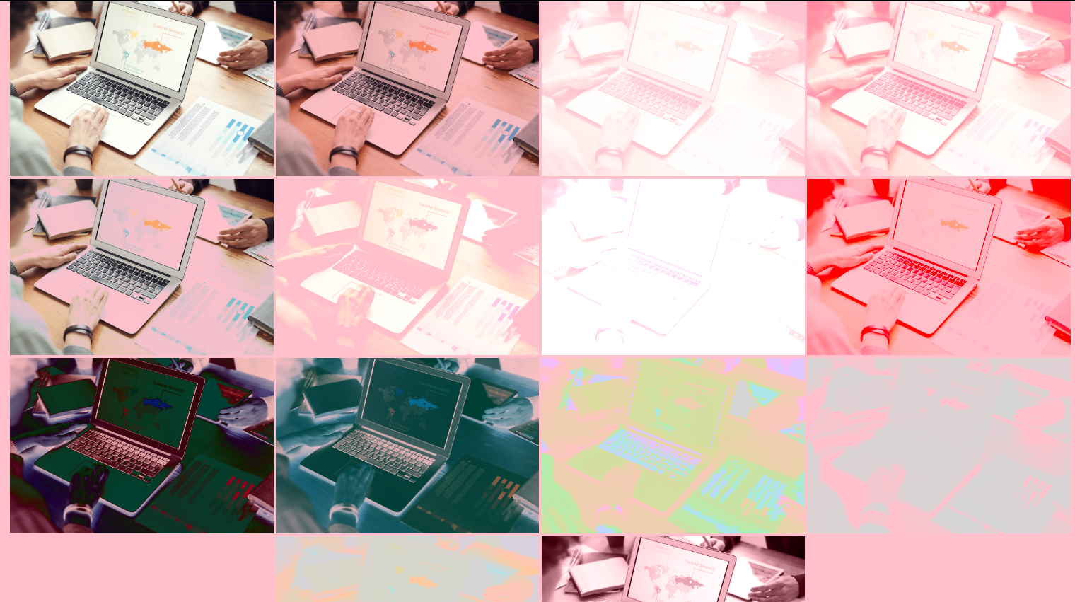
Here’s an example of how you can use various mix-blend-mode properties to achieve a cool effect that makes your content look professionally edited
Here are some of the values available with the mix-blend-mode property
mix-blend-mode: normal;
mix-blend-mode: multiply;
mix-blend-mode: screen;
mix-blend-mode: overlay;
mix-blend-mode: darken;
mix-blend-mode: lighten;
mix-blend-mode: color-dodge;
mix-blend-mode: color-burn;
mix-blend-mode: hard-light;
mix-blend-mode: soft-light;
mix-blend-mode: difference;
mix-blend-mode: exclusion;
mix-blend-mode: hue;
mix-blend-mode: saturation;
mix-blend-mode: color;
mix-blend-mode: luminosity;
mix-blend-mode: plus-darker;
mix-blend-mode: plus-lighter;
Output
Glowing Text effect
This effect grabs the user’s attention and gives your interface a dynamic, modern look. It’s made with a mix of CSS properties like box-shadow, text-shadow, and keyframe animations, creating a glowing, pulsating effect.
It’s great for highlighting specific text on your website, such as call-to-action buttons or key notices.However, it’s important to remember that this can also distract users from the main focal point. So, it is important to use it wisely and in the right context.
Here is an example of Glowing Text
input[type=“checkbox”]:checked ~ div {
box-shadow: inset 0 0 2px rgba(255, 255, 255, 0.05),
inset 4px 4px 6px rgba(0, 0, 0, 0.2);
color: yellow;
text-shadow: 0 0 15px yellow, 0 0 25px yellow;
animation: glow 1.5s linear infinite;
}
@keyframes glow {
0% {
filter: hue-rotate(0deg);
}
100% {
filter: hue-rotate(360deg);
}
}
Output

Codepen: https://codepen.io/adarsh-gupta101/pen/qBvrYMV
Masking
The mask-image property allows you to apply an image as a mask to an element. The parts of the element where the mask image is transparent become invisible, while the parts where the mask is opaque remain visible. It’s especially useful when you want to achieve complex shapes or visual effects that cannot be easily done with standard CSS shapes or borders.
Code:
<html lang=“en”>
<head>
<style>
body {
background-color: #000;
}
.container {
display: flex;
place-items: center;
justify-content: center;
height: 100vh;
}
.my-element {
width: 800px;
height: 402px;
object-fit: contain;
margin-left: 50px;
mask-image: url(./cat.svg);
mask-size: contain;
mask-repeat: no-repeat;
}
</style>
</head>
<body>
<div class=“container”>
<img
src=“https://images.pexels.com/photos/302769/pexels-photo-302769.jpeg?auto=compress&cs=tinysrgb&w=1260&h=750&dpr=1”
alt=“abstract art image”
height=“400”
/>
<img
src=“https://images.pexels.com/photos/302769/pexels-photo-302769.jpeg?auto=compress&cs=tinysrgb&w=1260&h=750&dpr=1”
alt=“abstract art image”
class=“my-element”
/>
</div>
</body>
</html>
Output
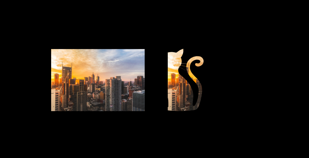
Here you can see that the image takes up the shape of the mask image.
CSS Filters for Image Effects
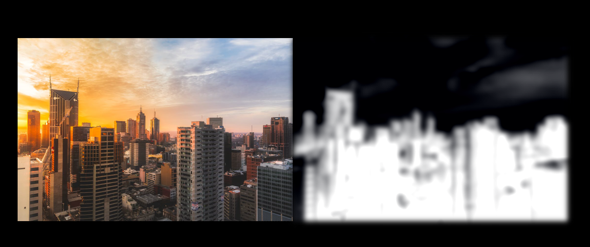
CSS filters enable you to apply visual effects such as blur, brightness, and contrast to images and elements. The filter property in CSS allows you to add graphical effects and they are mostly used to to adjust the rendering of images, backgrounds, and borders.
Each filter serves a unique purpose, allowing you to fine-tune the visual presentation to match the style and mood of your content.
Here are the common CSS Filters:
- Blur: blur(2px): Blurs the image.Ideal for creating a background that doesn’t compete with the text for attention
- Brightness: brightness(0.8) – Adjusts the brightness of the image. A value over 100% brightens the image, while a value under 100% darkens it.
- Contrast: contrast(120%) – Adjusts the contrast.
- Grayscale: grayscale(50%) – Converts the image to grayscale. It’s useful for creating a monochrome look or for design consistency across multiple images.
- Sepia: sepia(60%) – Applies a sepia tone to the image. It gives the image a warm, brownish tone, reminiscent of vintage photographs.
- Saturate: saturate(200%) – Adds saturation of colors in the image.
Here is an example of using CSS filters
Code
<html lang=“en”>
<head>
<style>
body {
background-color: #000;
}
.container {
display: flex;
place-items: center;
justify-content: center;
height: 100vh;
}
.my-element {
filter: blur(10px) grayscale(100%) contrast(200%) brightness(100%) sepia(10%) hue-rotate(10deg) saturate(100%) invert(100%) opacity(100%);
}
</style>
</head>
<body>
<div class=“container”>
<img
src=“https://images.pexels.com/photos/302769/pexels-photo-302769.jpeg?auto=compress&cs=tinysrgb&w=1260&h=750&dpr=1”
alt=“abstract art image”
/>
<img
src=“https://images.pexels.com/photos/302769/pexels-photo-302769.jpeg?auto=compress&cs=tinysrgb&w=1260&h=750&dpr=1”
alt=“abstract art image”
class=“my-element”
/>
</div>
</body>
</html>
Output
Custom Scrollbars
Styling scrollbars is a simple yet effective way to elevate your website’s look and feel. By using CSS, you can tailor the scrollbar to blend in with your site’s overall design, ensuring a smooth and unified visual flow.
You can control the styling of the scrollbar track (the background the thumb moves along) and the scrollbar thumb (the draggable element users interact with) using the ::-webkit-scrollbar and ::-webkit-scrollbar-thumb selector.
Here’s how you can give your website’s scrollbar a custom look using CSS:
<html lang=“en”>
<head>
<style>
body {
background-color: #000;
height: 200vh;
font-family: “Franklin Gothic Medium”, “Arial Narrow”, Arial, sans-serif;
}
/* Customizes the whole scrollbar */
::-webkit-scrollbar {
width: 12px;
height: 12px;
}
/* Customizes the scrollbar track (the part the thumb scrolls within) */
::-webkit-scrollbar-track {
background: #0be7d9;
border-radius: 10px;
}
/* Customizes the scrollbar thumb (the draggable part) */
::-webkit-scrollbar-thumb {
background: #7700ff;
border-radius: 10px;
}
/* Changes the thumb color on hover */
::-webkit-scrollbar-thumb:hover {
background: #ae2828;
}
h1 {
color: #fff;
font-size: 1rem;
text-align: center;
margin-top: 20%;
}
</style>
</head>
<body>
<h1>Talent500, The Operating System For Global Work</h1>
</body>
</html>

Shapes with clip-path
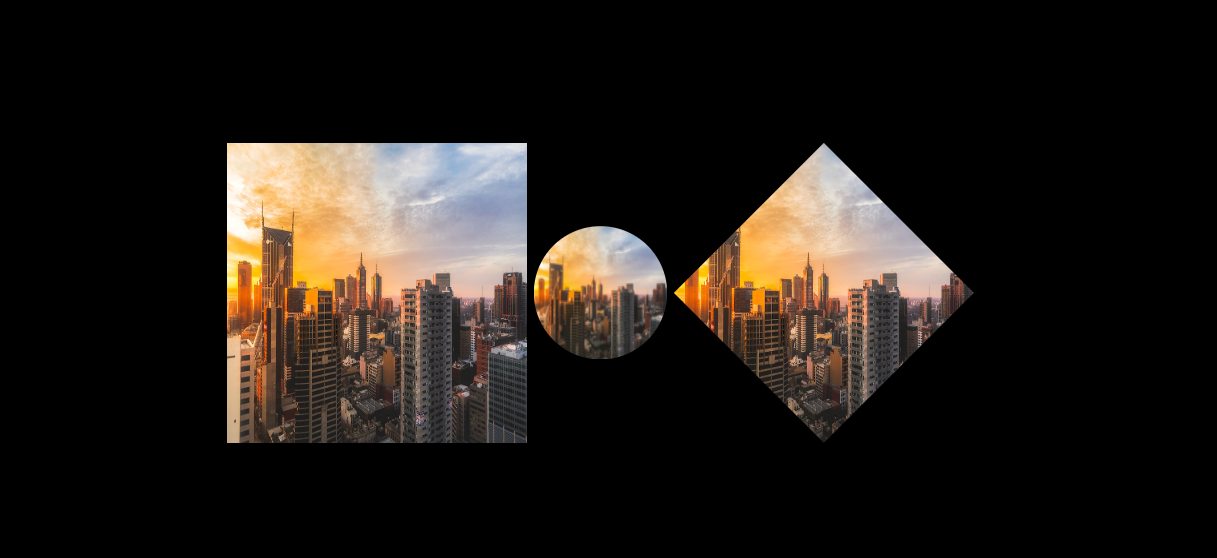
The clip-path property in CSS is a versatile property that allows you to define the visible portion of an element, effectively clipping it into various geometric shapes or even complex custom paths defined by an SVG.
The possible values of the clip-path property are
- circle(): Creates a circular clip path.
- ellipse(): Creates an elliptical clip path.
- polygon(): Creates a polygonal clip path with specified vertices.
- inset(): Creates a rectangular clip path with the possibility to round corners.
- path(): Defines a clip path with a custom shape using SVG path notation.
- url(): Links to an external SVG to define the clip-path.
Here is an example of using clip-path property
<html lang=“en”>
<head>
<style>
body {
background-color: #000;
}
.container {
display: flex;
place-items: center;
justify-content: center;
height: 100vh;
}
.my-element {
width: 200px;
height: 200px;
background-size: cover;
clip-path: circle(50% at 50% 50%);
margin: 10px;
}
.my-element__1 {
clip-path: polygon(50% 0%, 100% 50%, 50% 100%, 0% 50%);
}
</style>
</head>
<body>
<div class=“container”>
<img
src=“https://images.pexels.com/photos/302769/pexels-photo-302769.jpeg?auto=compress&cs=tinysrgb&w=1260&h=750&dpr=1”
alt=“abstract art image”
width=“450”
height=“450”
/>
<img
src=“https://images.pexels.com/photos/302769/pexels-photo-302769.jpeg?auto=compress&cs=tinysrgb&w=1260&h=750&dpr=1”
alt=“abstract art image”
class=“my-element”
/>
<img
src=“https://images.pexels.com/photos/302769/pexels-photo-302769.jpeg?auto=compress&cs=tinysrgb&w=1260&h=750&dpr=1”
alt=“abstract art image”
class=“my-element__1”
width=“450”
height=“450”
/>
</div>
</body>
</html>
Output
Creating a Frosted Glass Effect with backdrop-filter
The backdrop-filter CSS property brings a touch of sophistication to your web elements by applying graphical effects to the area behind an element. A popular use of this property is to create a frosted glass effect, where the background seems blurred through the translucent element, providing a sleek, modern aesthetic.
Here is an example
<html lang=“en”>
<head>
<style>
body {
background-color: #222;
margin: auto;
font-family: “Franklin Gothic Medium”, “Arial Narrow”, Arial, sans-serif;
}
.container {
display: flex;
justify-content: center;
align-items: center;
height: 100vh;
width: 100vw;
background-image: url(“https://images.unsplash.com/photo-1485470733090-0aae1788d5af?q=80&w=1000&auto=format&fit=crop&ixlib=rb-4.0.3&ixid=M3wxMjA3fDB8MHxjb2xsZWN0aW9uLXBhZ2V8MXwxNDQxNTZ8fGVufDB8fHx8fA%3D%3D”);
background-repeat: no-repeat;
background-size: cover;
}
.frosted-glass {
background: rgba(255, 255, 255, 0.2);
backdrop-filter: saturate(180%) blur(10px);
-webkit-backdrop-filter: saturate(180%) blur(10px);
padding: 20px; /* Spacing around the content */
border-radius: 10px; /* Optional: Rounded corners */
}
h1 {
color: white;
font-size: 50px;
text-align: center;
}
</style>
</head>
<body>
<div class=“container”>
<div class=“frosted-glass”>
<h1>Talent500 Makes Global Work, Work.</h1>
</div>
</div>
</body>
</html>
Output

In the output you can see that we have a nice visual appearance and frosted glass like effect.
Conclusion
Thanks for checking out this blog. In this detailed blog, we’ve delved into some awesome CSS tricks and tips that you can implement in your next project. We’ve discussed various CSS properties such as the clip-path property, mask-image property, mix-blend-mode property, and more.
Keep learning.





Add comment