We are living in a data-driven world where the ability to extract meaningful insights from complex datasets is crucial. Data visualization plays a pivotal role in transforming raw data into understandable visual representations. These visualizations not only make data interpretation easier but also help in effectively communicating insights to both technical and non-technical audiences.
In this blog, we will explore the importance of data visualization, different types of visualizations, and provide hands-on examples with code to demonstrate how to create impactful visual representations.
The Power of Data Visualization: A Brief Overview

Data visualization is the art of representing data in graphical or pictorial form, allowing patterns, trends, and relationships to become immediately apparent. Raw data can often be overwhelming and difficult to understand, especially for non-experts. Visualizations simplify complex information, making it accessible and digestible.
Why Visualize Data?
Humans are naturally visual creatures, and our brains process visual information faster than textual information. By using charts, graphs, and diagrams, we can quickly grasp insights that might take much longer to glean from tables of numbers. Data visualizations also enable us to explore data, spot outliers, detect trends, and tell compelling stories.
Types of Data Visualizations
Now that we have a fair idea about the importance of Data Visualizations, let us have a look at the different ways in which data can be visualized.
Line Charts
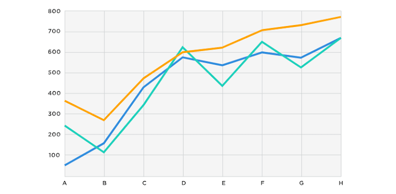
Line charts are ideal for showing trends over time or a sequence. They are commonly used in financial analysis, scientific data representation, and more.
Let us create a line chart using Python’s matplotlib library to visualize stock prices over a year:
python
import matplotlib.pyplot as plt
# Sample data: Months and corresponding stock prices
months = [‘Jan’, ‘Feb’, ‘Mar’, ‘Apr’, ‘May’, ‘Jun’]
prices = [100, 120, 90, 150, 130, 170]
plt.plot(months, prices, marker=’o’, color=’blue’, linestyle=’-‘, linewidth=2)
plt.xlabel(‘Month’)
plt.ylabel(‘Stock Price’)
plt.title(‘Stock Price Trend Over Time’)
plt.grid(True)
plt.show()
In this example, we’re plotting stock prices over several months. The marker argument adds circular markers at each data point, and color, linestyle, and linewidth parameters customize the appearance of the line. Adding grid lines with grid(True) enhances readability.
Let us have a look at another example of Line Chart
python
# Sample data: Years and corresponding sales
years = [‘2019’, ‘2020’, ‘2021’, ‘2022’, ‘2023’]
sales = [500000, 550000, 600000, 650000, 700000]
plt.plot(years, sales, marker=’s’, color=’green’, linestyle=’–‘, linewidth=2)
plt.xlabel(‘Year’)
plt.ylabel(‘Sales’)
plt.title(‘Yearly Sales Trend’)
plt.grid(True)
plt.show()
In this example, we’re visualizing the yearly sales trend using a line chart. The marker argument adds square markers, and color, linestyle, and linewidth parameters customize the line appearance.
Bar Charts
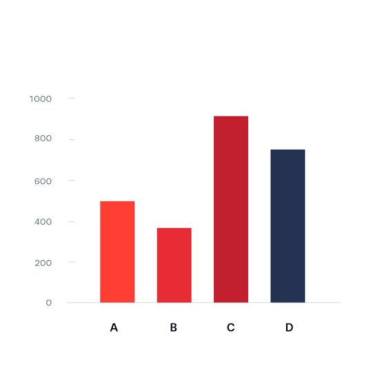
Bar charts are effective for comparing quantities of different categories. They are frequently used to visualize sales data, survey results, and categorical comparisons.
Here is an example of visualizing monthly sales using a bar chart:
python
months = [‘Jan’, ‘Feb’, ‘Mar’, ‘Apr’, ‘May’, ‘Jun’]
sales = [1200, 1500, 900, 1800, 1350, 1600]
plt.bar(months, sales, color=’green’)
plt.xlabel(‘Month’)
plt.ylabel(‘Sales Amount’)
plt.title(‘Monthly Sales Performance’)
plt.show()
This example shows monthly sales data, highlighting the differences between each month’s performance. The color parameter customizes the color of the bars.
Another Example of Bar Chart:
python
# Sample data: Cities and corresponding population
cities = [‘New York’, ‘Los Angeles’, ‘Chicago’, ‘Houston’, ‘Phoenix’]
population = [8538000, 3971000, 2716000, 2323000, 1719000]
plt.barh(cities, population, color=’purple’)
plt.xlabel(‘Population’)
plt.ylabel(‘City’)
plt.title(‘Population Comparison of Major US Cities’)
plt.show()
In this example, we are using a horizontal bar chart (barh) to visualize the population comparison of major US cities. The cities list contains city names, and the population list contains corresponding population values.
Pie Charts
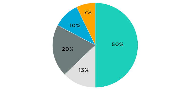
Pie charts are great for illustrating parts of a whole. They are often used to represent percentages and proportions.
Let us create a pie chart to display the distribution of expenses in a budget:
python
categories = [‘Rent’, ‘Groceries’, ‘Entertainment’, ‘Savings’]
expenses = [800, 300, 150, 750]
plt.pie(expenses, labels=categories, autopct=’%1.1f%%’, startangle=90, colors=[‘blue’, ‘green’, ‘red’, ‘purple’])
plt.axis(‘equal’)
plt.title(‘Monthly Expense Breakdown’)
plt.show()
In this example, we’re showing the percentage distribution of expenses. The autopct argument adds percentage labels to each slice, and startangle rotates the chart. The colors parameter customizes the colors of the segments.
Let us have a look at one more example
python
# Sample data: Browser usage statistics
browsers = [‘Chrome’, ‘Firefox’, ‘Edge’, ‘Safari’, ‘Others’]
usage = [60, 15, 10, 10, 5]
plt.pie(usage, labels=browsers, autopct=’%1.1f%%’, startangle=140, colors=[‘gold’, ‘orange’, ‘lightcoral’, ‘lightskyblue’, ‘gray’])
plt.axis(‘equal’)
plt.title(‘Web Browser Usage Distribution’)
plt.show()
In this example, we’re visualizing the distribution of web browser usage percentages. The browsers list contains browser names, and the usage list contains corresponding usage percentages.
Scatter Plots
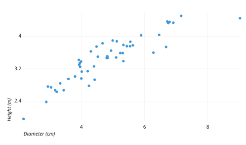
Scatter plots are used to visualize relationships between two numerical variables. They help us identify correlations and outliers.
Let us create a scatter plot to examine the correlation between study hours and exam scores.
python
study_hours = [2, 3, 5, 6, 7, 8, 9]
exam_scores = [65, 70, 75, 80, 85, 90, 95]
plt.scatter(study_hours, exam_scores, color=’orange’, marker=’x’)
plt.xlabel(‘Study Hours’)
plt.ylabel(‘Exam Scores’)
plt.title(‘Study Hours vs. Exam Scores’)
plt.grid(True)
plt.show()
In this example, we’re plotting study hours against exam scores. The color and marker arguments customize the appearance of the data points. Grid lines help visualize the data distribution more effectively.
Here’s another example for Scatter Plot
python
# Sample data: Car prices and their mileage
car_prices = [25000, 18000, 30000, 22000, 32000, 26000]
mileage = [22, 30, 18, 25, 15, 20]
plt.scatter(mileage, car_prices, color=’purple’, marker=’o’)
plt.xlabel(‘Mileage (MPG)’)
plt.ylabel(‘Car Price ($)’)
plt.title(‘Car Price vs. Mileage’)
plt.grid(True)
plt.show()
In this example, we’re visualizing the relationship between car prices and their mileage. The mileage list contains mileage values (miles per gallon), and the car_prices list contains corresponding car prices.
Conclusion
Data visualization is a powerful tool that transforms complex data into insightful visuals. Line charts, bar charts, pie charts, and scatter plots are a few examples of the diverse range of visualization techniques available. By mastering these techniques, you can effectively communicate insights, support data-driven decision-making, and unlock hidden patterns in your data. As we continue to explore data visualization, it is important to remember to choose the appropriate type of visualization for your data, customize visual elements for clarity, and provide context through labels and titles.
Start experimenting with different libraries and tools, such as matplotlib, seaborn, and Plotly, to create stunning visual representations that tell meaningful stories from your data.




Add comment