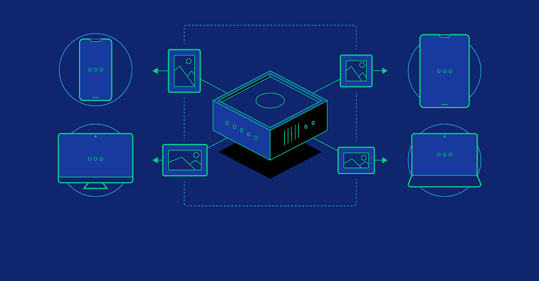
In today’s era, where users access websites and web applications on a wide range of devices and screen sizes, responsive design has become a crucial aspect of modern web development. Responsive design ensures that your web application looks and functions seamlessly across various devices, from desktops and laptops to smartphones and tablets. In this blog post, we will explore some essential responsive design techniques for full stack web applications. We will cover both frontend and backend strategies to create a responsive and user-friendly experience.
What is Responsive Design? A Brief Overview
Responsive design is about creating web applications that adapt and respond to different screen sizes and orientations. It involves designing and coding your application to provide an optimal user experience regardless of the device being used. The key principle is to use flexible layouts, fluid images, and media queries to adjust the design based on the device’s characteristics.
Responsive design goes beyond creating a single fixed layout that fits all devices. Instead, it employs a combination of design principles and coding techniques that ensure a consistent and pleasant experience across devices. It’s important to recognize that responsive design is not limited to frontend development; backend considerations also play a significant role in delivering a seamless user experience.
Viewport Meta Tag
The viewport meta tag is essential for controlling the initial scale and width of the viewport. By setting the viewport meta tag, you can ensure that your web application displays correctly on various screen sizes. Without this tag, mobile devices might render the page at a default scale, causing content to appear too small or too large.
The viewport meta tag allows you to specify the initial scale and width, ensuring that your application’s layout is optimized for the device.
For example:
html
<meta name=”viewport” content=”width=device-width, initial-scale=1.0″>
Here, width=device-width instructs the browser to set the width of the viewport to the device’s screen width.
The initial-scale=1.0 sets the initial zoom level to 1, preventing any undesired scaling.
Fluid Grid Layouts
Using a fluid grid system like CSS Grid or Flexbox allows you to create responsive layouts that adapt to different screen sizes. These grid systems provide a structured approach to building layouts that automatically adjust column widths and row heights based on the available space.
CSS Grid is a powerful tool that lets you define both rows and columns, creating a two-dimensional grid layout. The repeat(auto-fill, minmax(250px, 1fr)) property in the grid-template-columns rule creates a flexible layout with columns that adjust to the available space while maintaining a minimum width of 250px.
css
.container {
display: grid;
grid-template-columns: repeat(auto-fill, minmax(250px, 1fr));
gap: 20px;
}
Flexbox, on the other hand, is ideal for creating one-dimensional layouts, such as navigation menus and card layouts. Its flexible nature allows items to expand or shrink to fit the available space while maintaining their aspect ratio.
Media Queries
Media queries are CSS rules that allow you to apply styles based on the characteristics of the user’s device. By using media queries, you can create breakpoints where the design changes to better fit specific screen sizes.
Media queries work by targeting certain conditions, such as screen width or orientation. For instance, you might want to adjust font sizes and spacing for screens narrower than 768px:
css
@media (max-width: 768px) {
.header {
font-size: 18px;
margin-bottom: 10px;
}
}
Here, the @media rule applies the specified styles when the screen width is 768px or less. This ensures that the header text remains legible and properly spaced on smaller screens.
Flexible Images
Images are a crucial part of web design, and they need to adapt to different screen sizes. Without proper handling, images can appear too large or too small on different devices. The max-width: 100% property ensures that images do not exceed their container’s width, while the height: auto property maintains the image’s aspect ratio.
By applying these properties to images, you create a responsive image layout that adjusts to the available space while maintaining visual integrity.
css
img {
max-width: 100%;
height: auto;
}
Backend Techniques

Responsive design isn’t just about frontend coding; the backend plays a role as well. Backend techniques contribute to the overall user experience by delivering content tailored to the user’s device and capabilities.
Dynamic Content Generation: Server-side scripting languages like PHP, PythVon, or Node.js can generate dynamic content based on the user’s device. For instance, you might serve higher-resolution images to devices with larger screens while providing smaller images to conserve bandwidth on mobile devices.
APIs for Different Views: Create APIs that deliver content in various formats (JSON, XML) to accommodate different frontend designs for different devices. This approach is often used in mobile apps and progressive web applications where the same backend can serve multiple frontend interfaces.
Caching and Compression: Implement caching and compression techniques to reduce load times on different devices. By serving cached content and compressed assets, you can significantly improve the user experience, especially on slower connections.
Responsive Navigation: Navigation menus can become tricky on smaller screens, as traditional horizontal menus might not fit well. To address this, consider implementing techniques like “hamburger” menus or collapsible navigation items that save space while maintaining usability.
The hamburger menu is a common solution for mobile navigation. When clicked, it reveals a vertical list of navigation items, allowing users to access different sections of your application. To create a hamburger menu, you can use HTML and CSS:
html
<nav class=”mobile-menu”>
<div class=”menu-icon”>☰</div>
<ul class=”menu-items”>
<li><a href=”#”>Home</a></li>
<li><a href=”#”>About</a></li>
<li><a href=”#”>Services</a></li>
<li><a href=”#”>Contact</a></li>
</ul>
</nav>
css
.mobile-menu {
display: none; /* Hide on larger screens */
}
.menu-icon {
cursor: pointer;
}
/* Show the menu when the icon is clicked */
.menu-icon:hover + .menu-items,
.menu-items:hover {
display: block;
}
Testing and Debugging
Responsive design requires rigorous testing on different devices and browsers to ensure a consistent user experience. Browser developer tools provide valuable resources for simulating various screen sizes and troubleshooting layout issues.
During testing, it’s essential to verify that your design remains cohesive and usable across a variety of devices, including smartphones, tablets, laptops, and desktops. Debug and fix any layout anomalies that emerge during testing to ensure a polished presentation.
Frameworks and Libraries
Responsive design can be expedited with the use of frontend frameworks and libraries. These tools provide pre-designed responsive components that can save you time and effort while maintaining a consistent look and feel across devices.
Frameworks like Bootstrap and Foundation offer responsive grid systems, navigation bars, and other UI elements. These components can be customized to suit your application’s branding while adhering to responsive design principles.
Performance Considerations
While responsive design enhances the user experience, it’s crucial to consider performance implications. Loading large images and unnecessary JavaScript can slow down your application, especially on mobile devices with limited resources.
To optimize performance, ensure that images are appropriately compressed and scaled for different devices. Implement lazy loading to load images only when they are visible on the screen. Minimize the use of heavy libraries and scripts, and prioritize mobile-first development to create a fast and efficient experience for all users.
Conclusion
Responsive design is an essential aspect of modern web development, ensuring that your full stack web application delivers an excellent user experience across various devices. By implementing fluid layouts, media queries, and backend techniques, you can create a responsive design that adapts to the diverse landscape of devices and screen sizes. One needs to test rigorously and optimize for performance to provide users with a seamless and enjoyable experience on your web application. With these techniques, you can elevate your full stack web development skills and create web applications that delight users across all devices.


Add comment