React is a popular frontend UI library that is used in almost 50 million projects each month. React is supported by Facebook, has a number of notable companies, ranging from startups to Fortune 500 companies, and has dominated the web development market for more than nine years.
Due to React JS’s phenomenal growth, a variety of libraries, tools, and add-ons for styling, state management, page routing, etc. have successfully handled the limitations of the framework. As a React developer, styling your React application is typically what you’ll be doing most of the time.
Many great libraries have been developed since the advent of CSS libraries and frameworks to make it easier for developers to create user-friendly interfaces. Though many of them (such as Bootstrap, Bulma, and Foundation) comes with predefined components, negating the need for dynamic customization, they impose design decisions that are challenging to reverse. The developer has less control over the style of the component when using prebuilt components. This is one of the reasons why Tailwind CSS is an ideal choice for front-end developers who want to have full control of the UI.
In this detailed blog, we will cover all the fundamentals that you need to know to get started with Tailwind CSS in React.
So, let’s get started!
What is Tailwind CSS?
Tailwind CSS is an open-source utility-first CSS framework that makes it easy to apply excellent styling to your React web application by choosing from the framework’s ready-made CSS classes. Tailwind CSS gives you the creative control to create dynamic components – which means you can tweak the values of properties to make highly customizable UI components.

Tailwind CSS follows a mobile-first approach that enables developers to create web applications that are responsive. According to Npmjs, nearly 11 million projects use Tailwind CSS each month. With over 200 contributors, it is one of the most active open-source projects. One major benefit of using Tailwind CSS is that it results in a small CSS bundle by eliminating all unnecessary CSS and speeds up website loading.
Why Use Tailwind CSS?
The field of web development is vast, and new tools are constantly being developed. Developers can avoid a number of common issues by using Tailwind CSS. Simply by using the predefined class names, Tailwind assists in creating a UI that looks good.
The following are some advantages of Tailwind:
No naming convention: Having to name classes is one of the most difficult aspects of writing custom CSS. By offering utility-based classes, Tailwind CSS seamlessly resolves those issues.
Highly customizable: Tailwind CSS doesn’t provide you with a class name that represents the entire component; instead, it provides you with a class name that represents a specific style, such as height, width, margin, etc. These utility classes can be used to create a component from scratch.
Mobile-first strategy: The Tailwind CSS framework employs a mobile-first strategy by default. It is simpler to build complex responsive layouts freely thanks to the availability of all kinds of utility classes. Utility classes can be used conditionally across a range of breakpoints like sm, md, lg, etc., which aids in creating intricate responsive layouts.
Caching: Tailwind CSS uses the same class names repeatedly, so you won’t have to load the same styles repeatedly! This shortens the time it takes for a page to load during the development phase.
Since Tailwind CSS is a standalone framework, it can be used with virtually every current framework, including React, Angular, Gatsby, Laravel, and others.
Here, TailwindCSS will be explained using React.
Getting Started: Creating a React application
First thing first, you must have NodeJS installed on your PC in order to create a React application. You can download it from nodejs.dev.
Run the following code in the terminal to confirm that NodeJS is installed.

If the version number is printed, NodeJS has been successfully installed on your system, and the code to create a React app can now be executed. To create the React application, we’ll use the build tool create-react-app.
Run npx create-react-app on your terminal, and it will take care of the rest for you. After installation, you’ll see something like this:
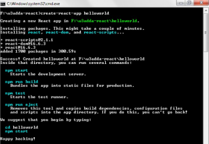
This is a good start, and you can now navigate to the project folder using the command cd project_folder_name. After that, running npm start will by default display the website at http://localhost:3000.
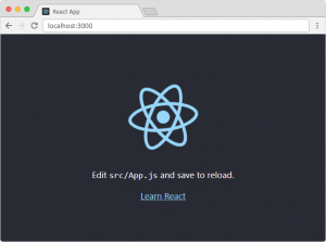
We are now all ready to use the React application. Let’s set up Tailwind CSS in our project now.
How to configure Tailwind CSS in React
Installing Tailwind CSS as a dependency and configuring the template path are all that are required to configure Tailwind CSS. We’ll proceed in the same manner and learn how to complete it on our own.
By running the following command, we can first add the Tailwind CSS as a dependency to our React project.

JavaScript plugins are used by PostCSS to make CSS compatible with the majority of browsers. With the help of these plugins, you can lint your CSS, support variables and mixins, transpile upcoming CSS syntax, inline images, and more.
Installing Autoprefixer and Tailwind CSS together is a requirement. It is a PostCSS plugin that uses caniuse.com values to add vendor prefixes to CSS rules automatically.
We can initialize Tailwind CSS by running the command tailwind init and it will create a default configuration file for Tailwind. After running the command, you will see a default tailwind.config.js like this:
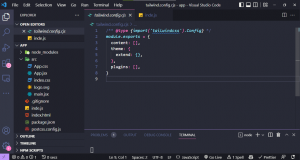
The tailwind.config.js file needs to be updated to include all of the paths to your template files. Since we are dealing with React here, you call the files with extensions like .js, .jsx, .ts, or .tsx.
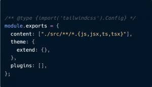
After adding the paths, you can now add the Tailwind directives to your CSS file. Add the following Tailwind layers to your CSS file, index.css in this case.
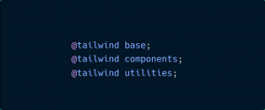
@tailwind base: It will inject Tailwind’s base styles, which combine Normalize.css and a few other base styles.
@tailwind components: This injects any component classes registered by plugins based on our config file (reusable styles like cards, buttons, form elements, etc.).
@tailwind utilities: This injects all of Tailwind’s utility classes (both the default and your customized utilities) which are generated based on our configuration file.
Now you can start your development server by running npm run start. By styling a simple text, you can determine whether Tailwind is installed properly or not.
filename:- index.js
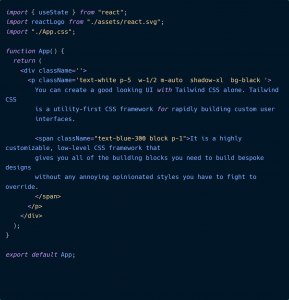
The output will be like this:
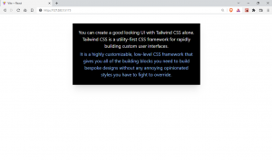
With just a few lines of code, we can create a small text component. You are now prepared to use Tailwind CSS in a practical setting.
Getting Started with Tailwind CSS
There are a number of pre-built classes in Tailwind CSS that we refer to as utility classes, and we can use their class names to apply the style to the appropriate element. The majority of the class names we required for our project are present, and we can also change the default configuration to include additional styles.
We will cover all the basics you need before starting a new project with Tailwind CSS:
Height & Width
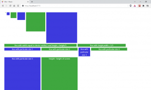
Tailwind has several utility classes for adjusting the height and width of the element. Pixel values, percentage values and relative values are all part of it.
We can look at a small example to visualize it.
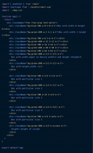
The output will be different boxes with various heights and widths.
Padding and Margin
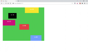
Tailwind has utility classes for setting margins and padding around the content that is similar to classes for height and width. You can use the values appropriately because they are almost identical to height and weight in terms of their properties, like mx-1 for margin-left: 0.25rem and margin-right: 0.25rem.
On the TailwindCSS official documentation, you can view every value that is offered.
Let’s look at a brief example where margin and padding are used.
Filename:- index.js
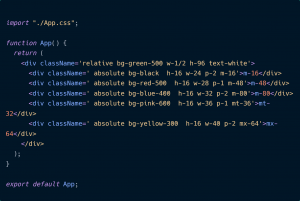
The output will be as follow:
CSS Flexbox and Grid
Almost all flexbox and grid properties can be defined using one of the many utility classes provided by Tailwind. Flex basics, flex-direction, flex-wrap, grid columns, grid rows, justify properties, align properties, and all other related classes are all available in Tailwind.
A simple example of CSS flexbox implementation using Tailwind CSS is shown below.
Filename:- index.js
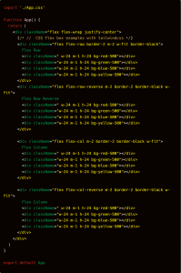
The output will be like this:
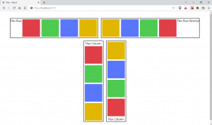
Almost all of the design requirements are met by Tailwind’s utility classes. The framework includes utility classes for CSS properties like margin, padding, layout, sizing, typography, backgrounds, borders, filters, effects, and animations.
Responsiveness in Tailwind CSS
With Tailwind, you can create responsive designs using utility classes, just like you would for the rest of your design. There are screen-size-specific versions of each utility in Tailwind. Tailwind by default adopts a “mobile first” strategy in which each screen size corresponds to a minimum viewport width.
By default, five breakpoints were designed after typical device resolutions:
sm: For devices with a width of greater than 640 pixels. It represents a normal mobile phone.
md: for devices with a width greater than 768px. It represents medium size devices.
lg: for devices with a width greater than 1024px. Usually for tablets and small laptops.
xl: for devices with a width greater than 1280px. These are mainly for desktop monitors.
2xl: for devices whose width is above 1536px. Usually for large screen external monitors.
Although it seems straightforward, this method is actually very effective and can be used to create complex, attractive, and responsive designs.
Creating a User Card with Tailwind CSS
Now, let’s use Tailwind CSS to create and style a user card.
Filename:- index.js
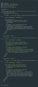
When we create a responsive user card with Tailwind CSS, the desktop view looks like this:

It looks clean and tidy. Now let’s take a look at the mobile view.

Here, you can see how we were able to create an aesthetically pleasing interface using just a few lines of code, all thanks to Tailwind. You can clearly see that this method produces understandable code as compared to plain CSS.
Adding Custom Styles to TailwindCSS
Figuring out what to do when a framework isn’t able to provide for all of your needs can be difficult when using one, which is oftentimes the biggest challenge. Tailwind was created with extensibility and customization in mind, so no matter what you’re building, you’ll never feel like you’re at odds with the framework.
Add your customizations to the theme section of your tailwind.config.js file if you want to change things like your color scheme, spacing scale, typography scale, or breakpoints:
filename: tailwind.config.js
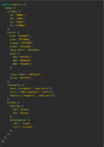
You can add custom new styles to the config file like this. Tailwind CSS offers a default theme with a very generous set of values to get you started, but don’t be hesitant to modify it or expand upon it; you’re encouraged to customize it as much as you need to meet the needs of your design.
You can also add arbitrary values something like top-[125px], m-[19px]. This applies to everything in the framework, including pseudo-element content, background colors, font sizes, and more. You can also use square bracket notation to create totally arbitrary CSS if you ever need to use a CSS property for which Tailwind doesn’t already include a utility.

You might have realized by now, after reading this article, why Tailwind is one of the best CSS frameworks. Styling your web application is simple with TailwindCSS.
You can always go to online communities and ask for help if you ever find yourself stuck with a problem. The Tailwind CSS team also provides prompt solutions to ensure that problems are resolved quickly.
Tailwind CSS has created quite a stir in the technologically advanced world, but there are many other reasons too that make Tailwind the preferred choice for developers.
Wrapping It Up!
Congratulations on reaching this far! You’re a fantastic reader!!
In this detailed blog on Tailwind CSS in React, we looked at how we can make our application look beautiful and clean with Tailwind CSS. We’ve spoken about installation, customizing, and identifying the best practices with Tailwind CSS. This blog is a good start if you want to start using Tailwind in your next project.
Now you know how to style your React application with Tailwind CSS in the most effective and efficient way.
Happy Styling!


Add comment