

Effects and design are essential elements of building a website. A website’s design is the first thing a visitor notices, and it can have a significant impact on their first impression.
According to Forbes, 38% of users won’t engage with a website if its layout is unattractive, So a well-designed website is essential for enhancing user experience and encouraging greater engagement.
By utilizing consistent design elements such as colour, typography, and visual effects, a website can create a memorable brand image.
The key points about the importance of visual effect for a website as it influences first impressions, user engagement, branding, usability, emotional connection, and competitiveness.
By focusing on creating a visually appealing design that aligns with the brand’s identity and engages the target audience, businesses can enhance the overall user experience and achieve their goals more effectively.
To create cool visual effects for a website, we can leverage the power of CSS masking.
Earlier to the introduction of CSS Masking, developers used different techniques to achieve similar effects, such as using transparent PNG images or SVG masks. However, these techniques were usually less flexible and more cumbersome to implement than CSS Masking. Since its origin, it has been used in different web development projects to achieve various visual effects, including image cropping, custom shapes, and background masking.
CSS Masking
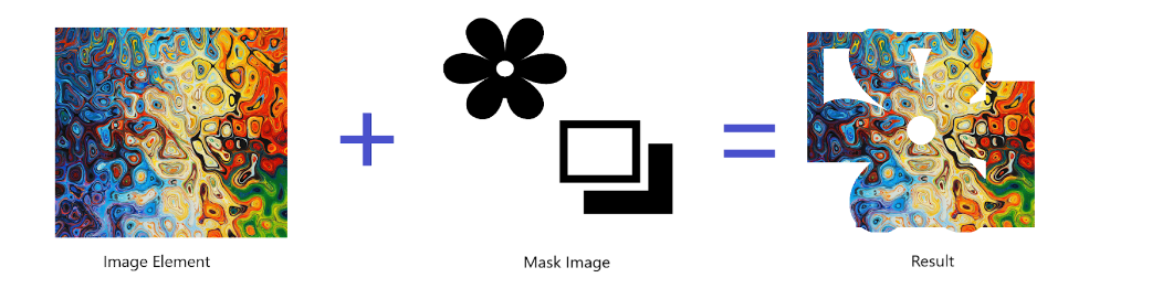
The purpose of CSS Masking was to define how HTML elements can hide or show specific parts of an element on a web page. It can create exciting opacity effects and visual effects, such as making an image look like it has been cut out and placed on top of another element.
Let’s suppose we are designing the hero section for a website. In that case, to make it a more interesting effect, we can use CSS masking, as you can see in the below image.
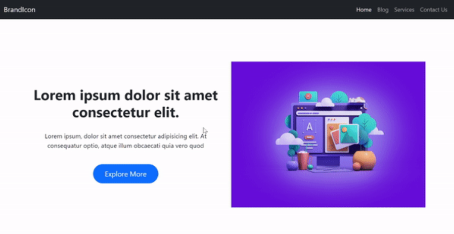

You will see the code of this hero section at the end of this blog:)
An image to be set as a mask should contain transparent and non-transparent areas. A portion of the element under the non-transparent area stays visible, while the remaining amount under the transparent part of the image gets hidden.
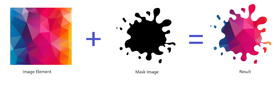

As you can see in the image above, when we merge the image element and the mask image, the final result has been cropped as the desired output. Where the black colour indicates full transparency while the white colour represents non-transparent.
CSS masking is achieved using the following CSS properties:
- mask-image: The mask-image property is used to define an image that will be used as the mask.
- mask-position: The mask-position property is used to define the position of the image mask.
- mask-size: The mask-size property is used to define the size of the image mask.
- mask-repeat: The mask-repeat property sets how the mask image should be repeated, such as repeat or no-repeat.
- mask-clip: The mask-clip property determines whether the mask should be clipped to the bounds of the masked element.
- mask-origin: The mask-origin property sets the origin of the mask.
mask-image
The mask-image property is used to apply an alpha mask to an element, allowing you to create exciting effects by selectively displaying or hiding certain pieces of the element.
The mask image needs to have a transparent or semi-transparent area, otherwise, it will not work as expected.
The mask-image property is very similar to the background-image property, where we can pass the image as a mask using the URL () or linear-gradient() function to an element.
Syntax:
.element{ mask-image: none | image-source | gradient; }
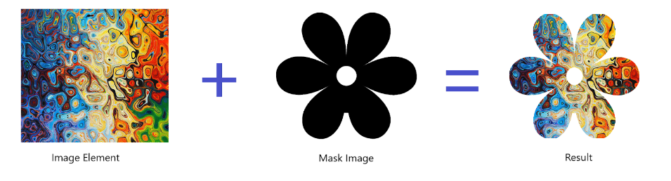

As you can see in the above illustration of the mask image, the black parts of the image are visible, while the white parts of the image are not visible (hidden) in the final resultant image.
Let’s see the code: HTML
<div class=“container“>
<img
class=“example-mask“
src=“https://abbeyjfitzgerald.com/wp-content/uploads/2017/10/colorful-artwork.jpg“
alt=“Masked image“
/>
</div>
CSS Code:
.example-mask {
mask-image: url(https://pic.onlinewebfonts.com/svg/img_40055.png);
-webkit-mask-image: url(https://pic.onlinewebfonts.com/svg/img_40055.png);
}
Play with the Codepen link: CSS Mask Image (codepen.io)
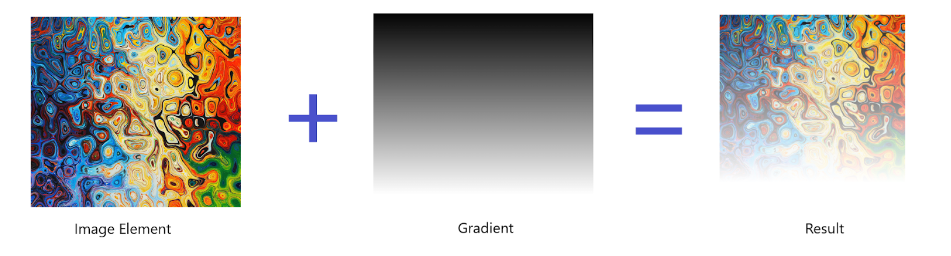
Gradient as Mask-image
If a gradient is passed as the mask image, then that will also be applied as a mask. Where the black part is displayed, and the white part of the mask image is semi-transparent.

.example-mask {
mask-image: linear-gradient(rgba(0, 0, 0, 1), transparent);
-webkit-mask-image: linear-gradient(rgba(0, 0, 0, 1), transparent);
}
Play with the Codepen link: CSS Gradient Mask (codepen.io)
Multiple images as Mask-image
If multiple images are passed to the mask-image property as sources separated by commas, then they will all be applied to the element, where the black part will be visible and the white part will not be visible.

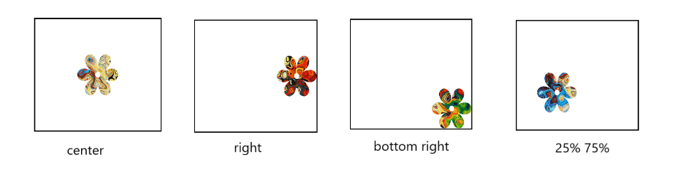
mask-position
The mask-position property defines the position of a mask image that is used to hide portions of an element. By default, the value of the mask position is the top-left corner of the background element.
Syntax:
.element{
mask-position: top | bottom | center | left | right;
mask-position: top center | left bottom; //two values
mask-position: 50% 25%;
}
The mask-position property in CSS can take the following values:
- One position value: A single value defines the horizontal position of the mask image and sets the vertical position to the centre.
- Two position values: This specifies the horizontal and vertical position of the mask image.
- Keyword value: We can also pass those above keywords, such as top, left, right, centre, and bottom, as the value of the mask-position property.
Have a look at the below illustration to understand the mask-position property.

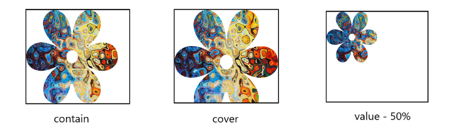
mask-size
The mask-size property is used to define the size of the mask; it has two properties: width and height. These properties can be set using either absolute or relative values.
During setting the size, it is important to note that the dimensions of the image are applied. If the mask image is larger than the element, it may not give the desired output, and if it is smaller, it may also not fully display the desired portion of the image. It will attempt to select the correct size based on your image.
Syntax:
.element {
mask-size: contain | cover;
mask-size: <width>; //height will be auto-set
mask-size: <width> <height>;
}
The mask-size property in CSS can take the following values:
- Contain: It scales the mask image to fit within the content area of the image element while preserving its aspect ratio.
- Cover: When this value is defined, the mask image will cover the entire image element.
Width and Height: This value defines the size of the mask image. The first value sets the width, and the second value sets the height, of the mask image. If only one value is passed, then it sets both the width and height of that mask image.

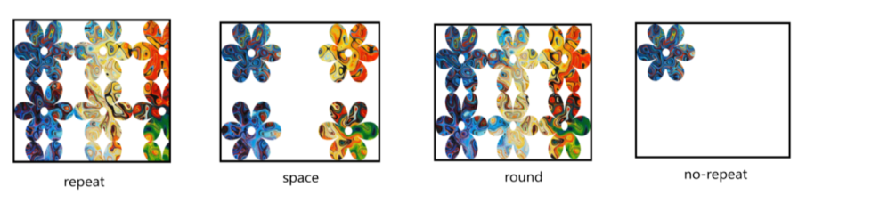
mask-repeat
The mask-repeat property is used to define how a mask image will be repeated within the element that is being masked. Several types of keywords can be used as values for the mask-repeat property. Such as, repeat, repeat-x, repeat-y, space, round, and no-repeat.
Syntax:
.mask {
mask-repeat: repeat, repeat-x, repeat-y, no-repeat, space, round;
}
Let’s know more about these values:
- repeat: The mask image is repeated in both horizontal and vertical directions to fill the entire element.
- repeat-x: The mask image is repeated horizontally to fill out the entire width of the element, but it is not repeated vertically.
- repeat-y: The mask image is repeated vertically to fill out the entire height of the element, but it is not repeated horizontally.
- space: The mask image is repeated as many times as possible without clipping, and the spacing between each image is evenly distributed.
- round: The mask image is repeated as many times as necessary to fill the element without clipping, and the spacing between each image is either stretched or compressed to accommodate the image without leaving any space.
- no-repeat: The mask image is not repeated at all, and is displayed only once within the element.

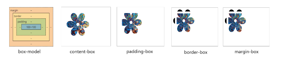
mask-clip
The mask-clip property determines the area of the image element where the mask will be applied, by specifying a geometric shape that defines the clipping region.
Syntax:
.element {
mask-clip: content-box | padding-box | border-box | margin-box | no-clip |fill-box | stroke-box | view-box;
}
These are the following values of the mask-clip property:
- content-box: The masking area is restricted to the content box.
- padding-box: The masking area is restricted to the padding box.
- border-box: The masking area is restricted to the border box.
- margin-box: The masking area is restricted to the margin box.
- no-clip: The area doesn’t get clipped.
- fill-box: The masking area is restricted to the object bounding box.
- stroke-box: The masking area is restricted to the stroke bounding box.
- view-box: The masking area is restricted to the width and height values of the view-box attribute.
mask-origin
The mask-origin property is used to define the position from where the mask image will get created in reference to the components of the box model.
Syntax:
.element {
mask-origin: content-box | padding-box | border-box | margin-box;
}
Note: There are also three other possible values for mask-origin, fill-box, strike-box, and view-box. They apply to SVG elements, but are in experimental mode and not supported by any major browser yet.
These are the following values of the mask-origin property:
- content-box: places the mask at the top-left corner of the content-box.
- padding-box: Place the mask at the top-left corner of the padding-box.
- border-box: Place the mask at the top-left corner of the border-box.
- margin-box: Place the mask at the top-left corner of the margin-box.

Let’s design the hero section
As shown in the initial image of this blog, we are now able to integrate all properties to create impressive designs.
HTML Code
<div class=“col hero-img-col“>
<img
class=“hero-img“
src=“https://mir-s3-cdn-cf.behance.net/project_modules/max_632/aa8625109287767.5fd08439c7676.jpg“
alt=“hero-img“
/>
</div>
CSS Code
.hero-img {
mask-repeat: no-repeat;
mask-size: 90%;
mask-position: center;
-webkit-mask-repeat: no-repeat;
-webkit-mask-size: 90%;
-webkit-mask-position: center;
}
.hero-img:hover {
mask-image: url(https://i7x7p5b7.stackpathcdn.com/codrops/wp-content/uploads/2014/10/mask-image.png);
-webkit-mask-image: url(https://i7x7p5b7.stackpathcdn.com/codrops/wp-content/uploads/2014/10/mask-image.png);
}
You can also have fun playing with this codepen link.
Mask Property
The mask a shorthand property in CSS allows us to conveniently specify all the mask properties we have discussed above. It enables us to set the image source, clipping path, position, etc. in a single line.
Syntax:
.mask {
mask: <mask-image> <mask-repeat> <mask-position> <mask-clip> <mask-origin> <mask-size>;
}
Summary
- mask-image: It is used to apply an image or gradient as a mask.
- mask-repeat: It is used to specify the repetition pattern of a mask.
- mask size: It is used to control the size of a mask.
- mask-position: It is used to specify the position of a mask.
- mask-origin: It is used to control the starting position of a mask.
- mask-clip: It is used to restrict the area available to apply a mask.
- mask: It is a shorthand property to specify all the mask-* properties.
Conclusion
In conclusion, CSS Masking is a powerful feature that empowers developers to push the boundaries of design and creativity. By leveraging its capabilities, web pages can be transformed into visually stunning and immersive experiences, capturing the attention of users and elevating the overall quality of web design.
Also, if you are looking for a JavaScript job, so please search them on talent500.co
